Connect BI Tool
TSDB has been connected to Baidu AI Cloud Sugar. Users can access TSDB through SugarBI and conduct various interactive data analysis on the data stored in TSDB. At present, this service is still in the open beta test period. If you have already obtained the account information through Support MySQL Protocol, you can use it directly; otherwise, please Submit Ticket for Application. Baidu AI Cloud Sugar provides all new and old users with a 30-day free full-function trial. After 30 days, you need to pay for it. Please refer to Sugar Product pricing.
Create Data Source
-
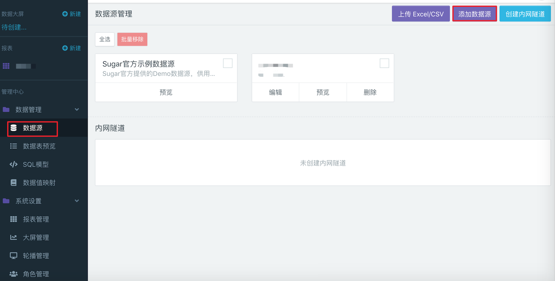
After Login to Sugar, automatically enter the 「Space Square」 and click any space in 「My Space」 to enter the space page. - Click 「Data Management」 > 「Data Source」 > 「Add Data Source」 on the left side of the space page to add Baidu TSDB data source.
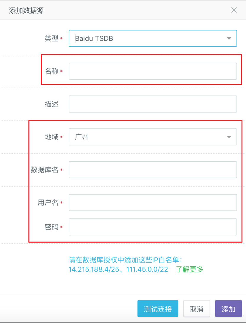
- In the pop-up data source edit box, enter the user-customed data source name in 「Name」, enter the name and region of the TSDB instance to be accessed under the user's name in 「Database Name」 and 「Region」, and the 「User Name」 and 「Password」at the bottom require the user to submit a ticket application to obtain.
Report Example
The following part briefly explains how to make reports to analyze the data stored in TSDB.
Create a Report
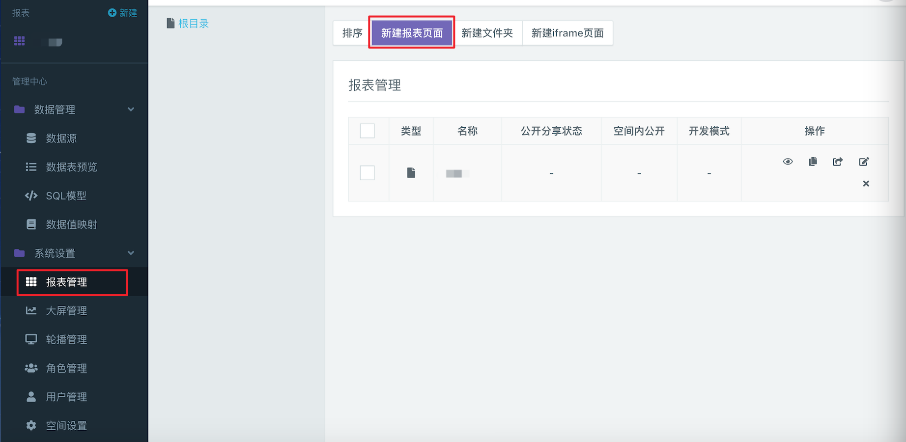
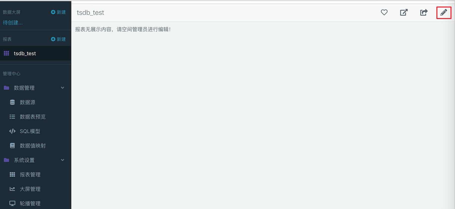
- First, enter 「Report Management」 in the console on the left, and create a new report page.
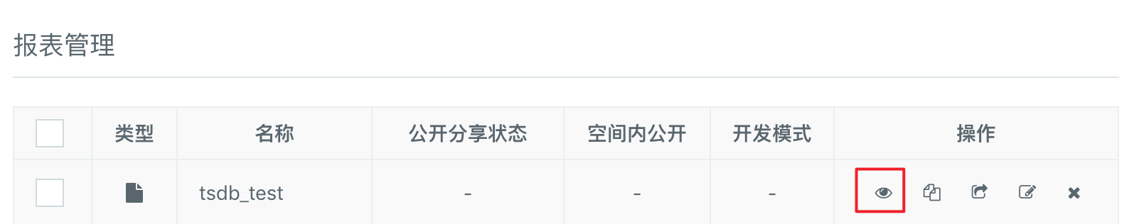
- In the 「Report Management」 list, select the report you want to edit and click the eye icon behind the report to enter the Report Details page.
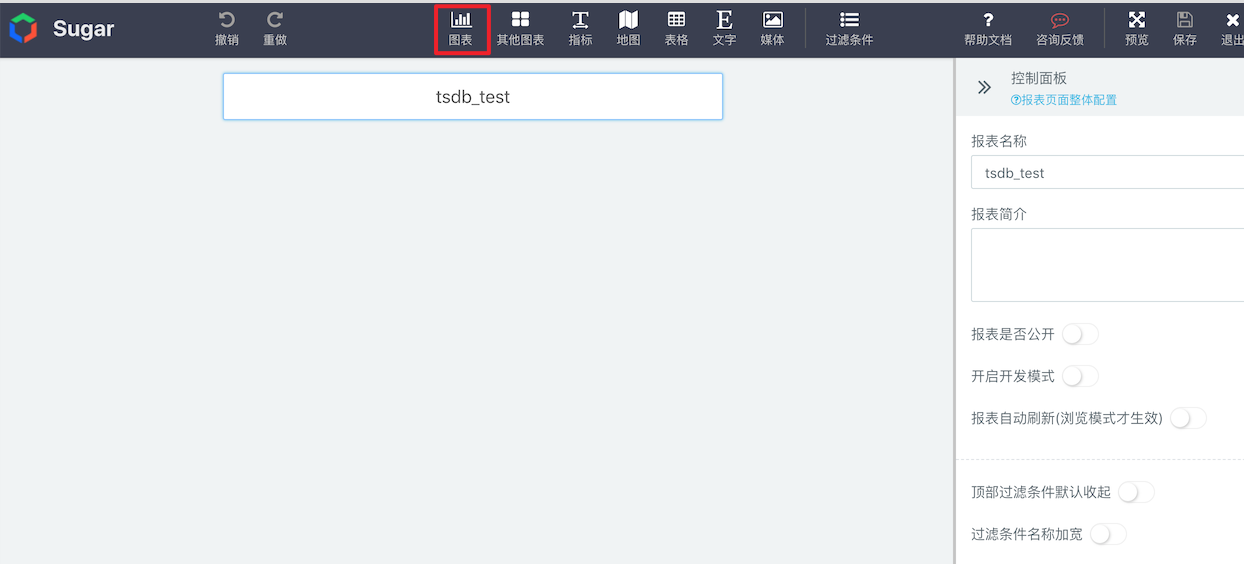
- On the Report Details page, click the Edit button in the upper right corner to enter the Edit mode.
- Now we can add our favorite charts and bind SQL models to show our data. How to add charts and bind data?
Application Example
The sample data source we use here contains weather simulation data (unreal data) on wind collected at 8: 00 a.m. every day at each air monitoring station in Beijing, Shanghai and Guangzhou throughout 2015. When the date stored in the TSDB, Wind is metric, representing that TSDB stores weather data about the wind. There are two fields under metric, which are speed and direction.The name and zip code of the city to which each data point belongs and the geographical location (longitude and latitude) of the monitoring station corresponding to the data point are used as tag.
According to the above example data, we can make appropriate reports according to the following scenarios:
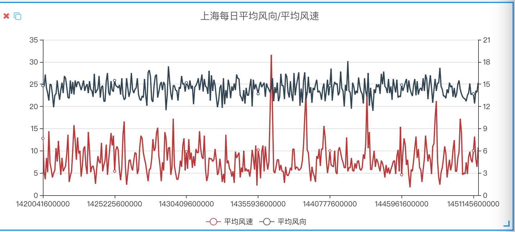
Scenario 1: Make a report to analyze the daily wind direction and average wind speed in Shanghai in 2015.
- First, create a new chart. To observe the trend, we have chosen the line chart here.
- Create a new SQL model in the 「Control Panel」 > 「Data」 > 「SQL Modeling」 corresponding to the line chart.
- Enter the following SQL query statement in the model edit box and set the field model.
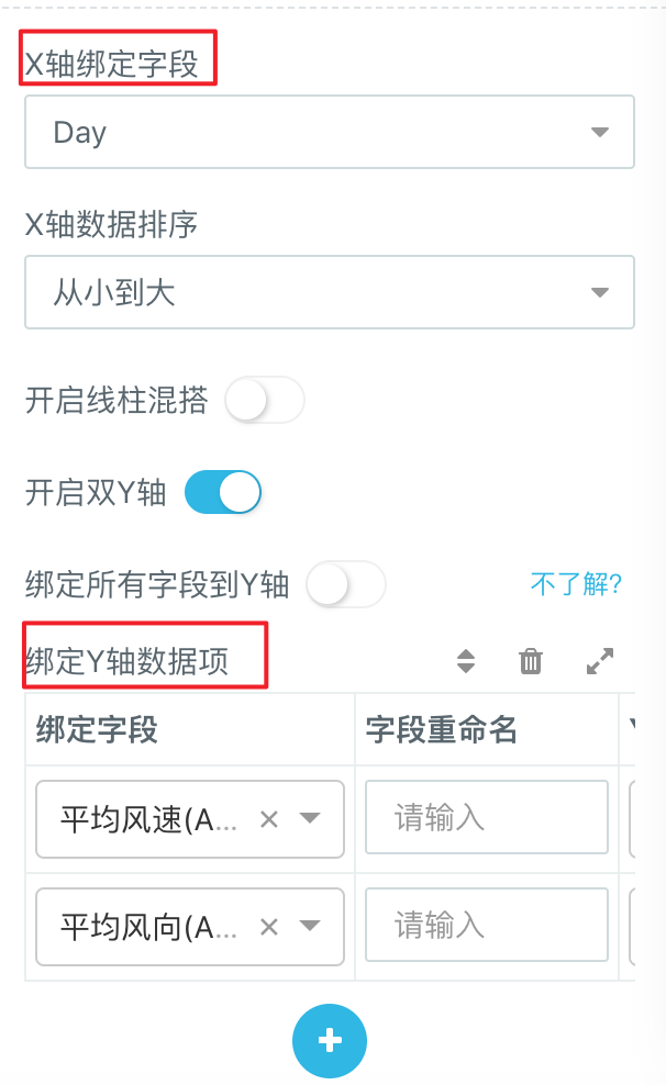
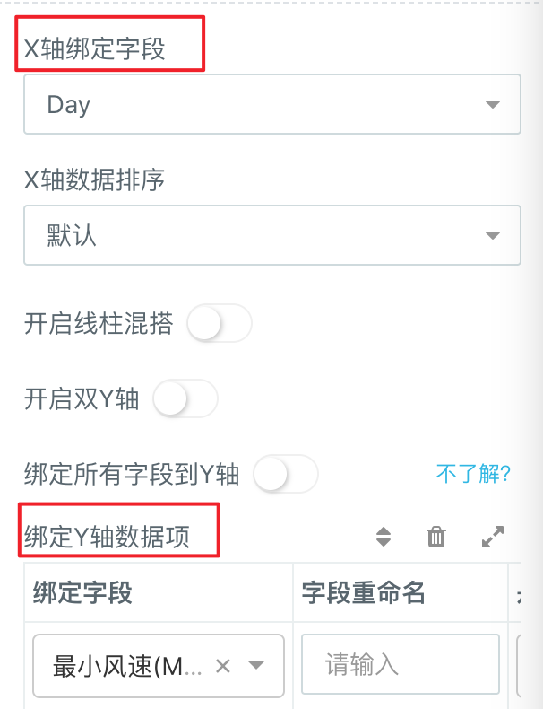
- Finally, return to the 「Control Panel」 > 「Data」 to bind the corresponding data for the X-axis and Y-axis, and click Refresh to generate the report we need.
select avg(speed) as Avg_Speed, avg(direction) as Avg_Direction,
 time_bucket(timestamp, '1 day') as Day
 from wind
 where city = 'Shanghai'
 group by time_bucket(timestamp, '1 day')
 order by time_bucket(timestamp, '1 day')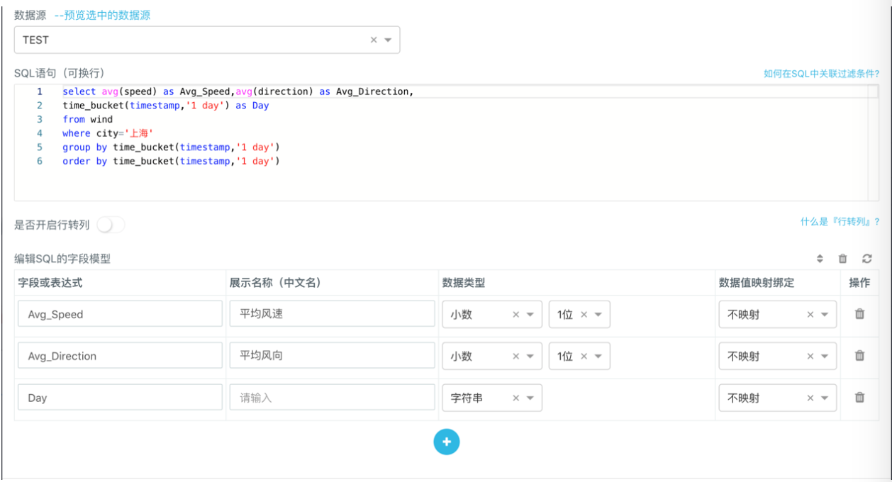
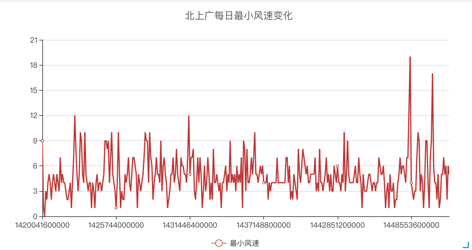
Scenario 2: Make a report to analyze the daily minimum wind speed collected by all monitoring points in Beijing, Shanghai and Guangzhou in 2015.
- First, create a new chart. To observe the trend, we have chosen the line chart here.
- Create a new SQL model in the 「Control Panel」 > 「Data」 > 「SQL Modeling」 corresponding to the line chart.
- Enter the following SQL query statement in the model edit box and set the field model.
- Finally, return to the 「Control Panel」 > 「Data」 to bind the corresponding data for the X-axis and Y-axis, and click Refresh to generate the report we need.
select min(speed) as Min_Speed, time_bucket(timestamp, '1 day') as Day
 from wind
 where city in ('Beijing','Shanghai','Guangzhou')
 group by time_bucket(timestamp, '1 day')
 order by time_bucket(timestamp, '1 day')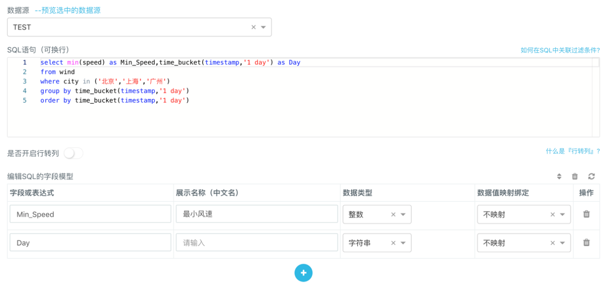
Aggregate Query
It should be noted that when making aggregate queries, the field names during grouping must interface with time_bucket function, and the timestamps must be appropriately aggregated according to the cycle of data collection. Otherwise, the generated charts may have unnecessary interruptions and cannot display trend changes. In the above example, the collection cycle is once a day, so the cycle of one day shall be used for the time_bucket aggregate to generate a continuous line graph.
time_bucket(timestamp, '1 day')Drill-down Example
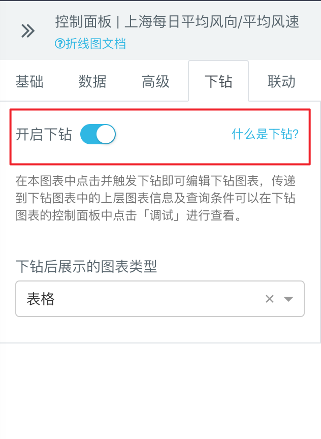
After the report is made, the user can select a chart and click 「Drill Down」 to open the drill down function. 「Drill Down」 means that when you click on a part of a chart, you can open a new chart or hyperlink to view the details related to this part of the chart. Here we use the previously generated line chart of Shanghai's average wind speed and direction as an example to briefly illustrate how to drill down.
- Click the line chart you want to drill down, click the tab in 「Control Panel」 > 「Drill Down」 on the right to turn on the drill down and set the triggered drill down chart type to be a table. (Note: Line charts can only trigger a single type of drilling down, while some types of charts can trigger Multiple Types of Drilling Down
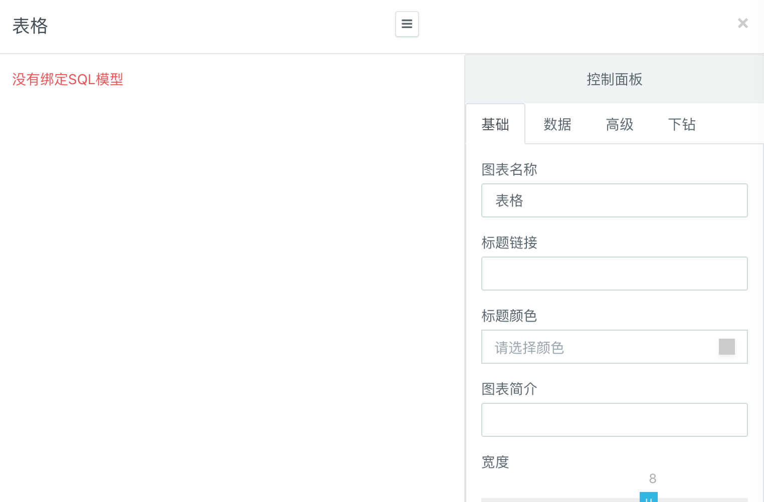
- Click any point in the line chart to trigger the drill down and open the drill down data display box. The data we drilled down is now on the left and on the right is the 「Control Panel」 that users can edit and set.
- Through the 「Drill Down」, although the current line chart only shows the average wind speed and direction of Shanghai, we can select any data point in the chart to view the wind speed and direction information collected by each monitoring point in Shanghai corresponding to that point in
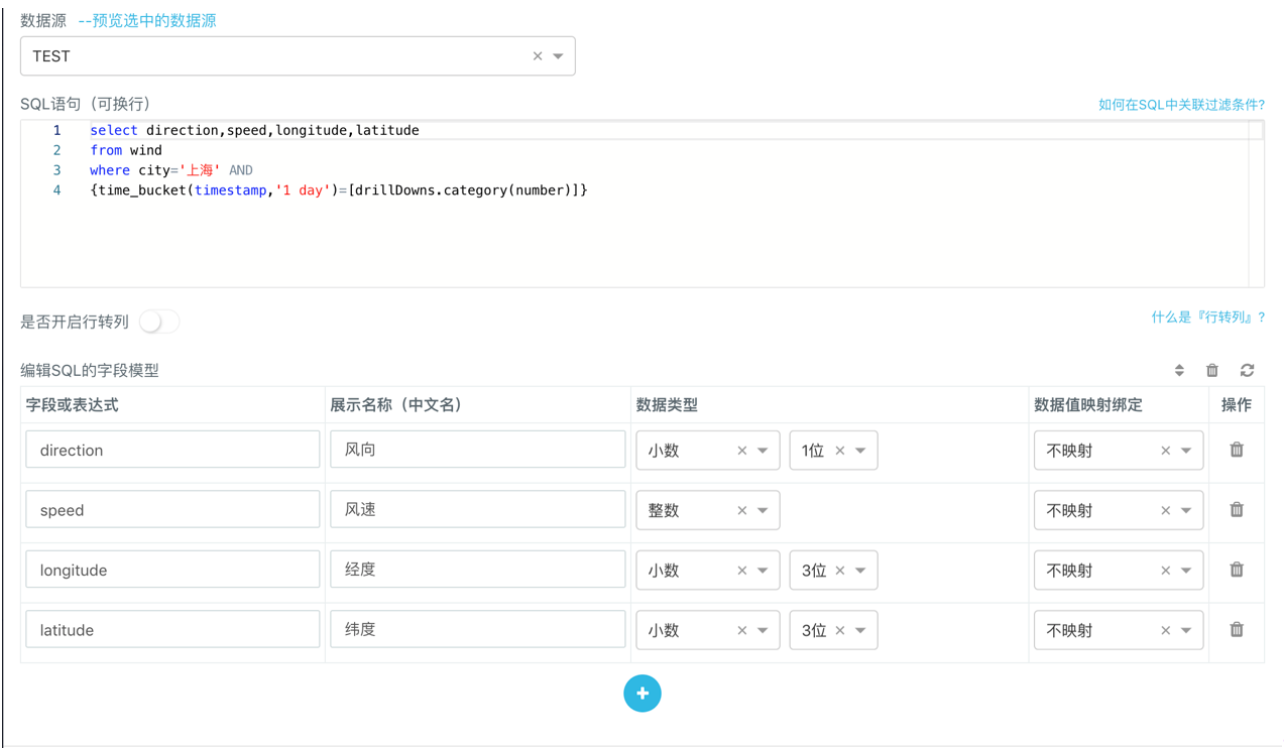
timestamp. For example, we select any data point oftimestamp=1436544000000on the line chart and create a new SQL model in the pop-up 「Control Panel」 > 「Data」 > 「SQL Modeling」. Enter the following SQL query statement in the model edit box and set the field model.
select direction, speed, longitude, latitude
 from wind
 where city='Shanghai' AND time_bucket(timestamp, '1 day') = 1436544000000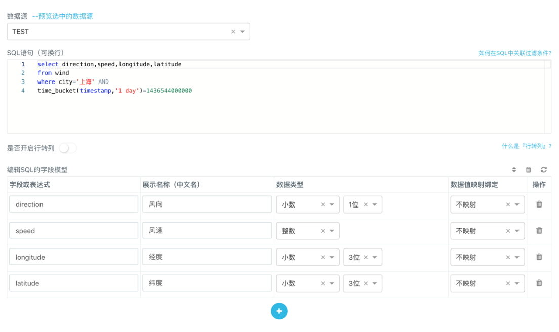
Because in the example line chart, timestamp has been aggregated with time_bucket functions, when modeling the drill down, filtering according to timestamp conditions needs to be changed to filtering according to time_bucket functions, otherwise data cannot be queried.
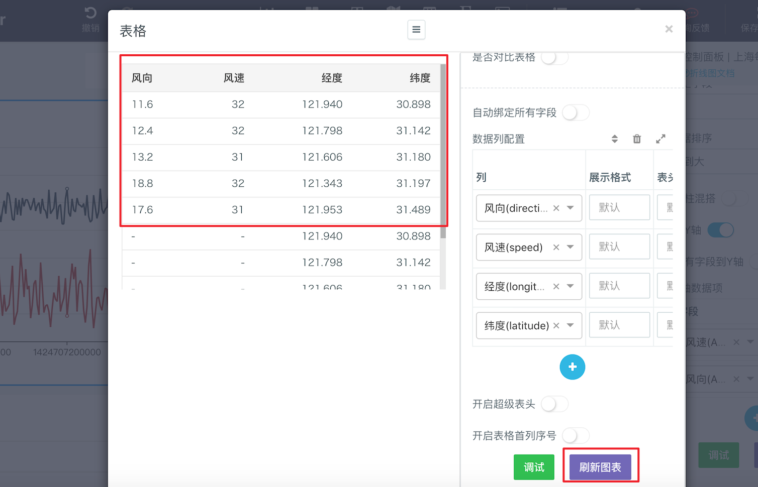
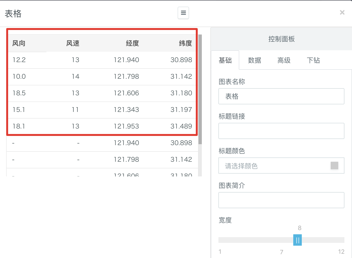
time_bucket(timestamp, '1 day') = 1436544000000- After refreshing the chart, you can see on the left the wind speed and direction information collected by a total of 5 monitoring points in Shanghai on
timestamp=1436544000000day:
- More conveniently, we can also use the Drill-down Parameters to write SQL models for drill-down. For example, we can replace the previously constant
timestampwith thecategoryvariables insidedrillDowns. After such modification, as long as any point on the line chart is selected, the chart showing the drill-down data will be automatically refreshed directly according to thetimestampof the selected point to generate the wind speed and direction information collected by all monitoring points in Shanghai respectively in the correspondencetimestampof the selected point without manually modifying the SQL statement.
select direction, speed, longitude, latitude
 from wind
 where city='Shanghai' AND
 {time_bucket(timestamp, '1 day')=[drillDowns.category(number)]}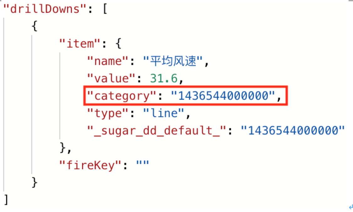
For example, if we select any data point of timestamp=1420041600000 and click to trigger the drill down. The pop-up data display box has already displayed the wind speed and direction information collected by a total of 5 monitoring points in Shanghai on timestamp=1420041600000 day. We do not need to manually update the timestamp values in the SQL model.
Example of Large Screen Display
The following part briefly introduces how to display the report on a large screen. For detailed tutorials, please refer to Large Screen Production.
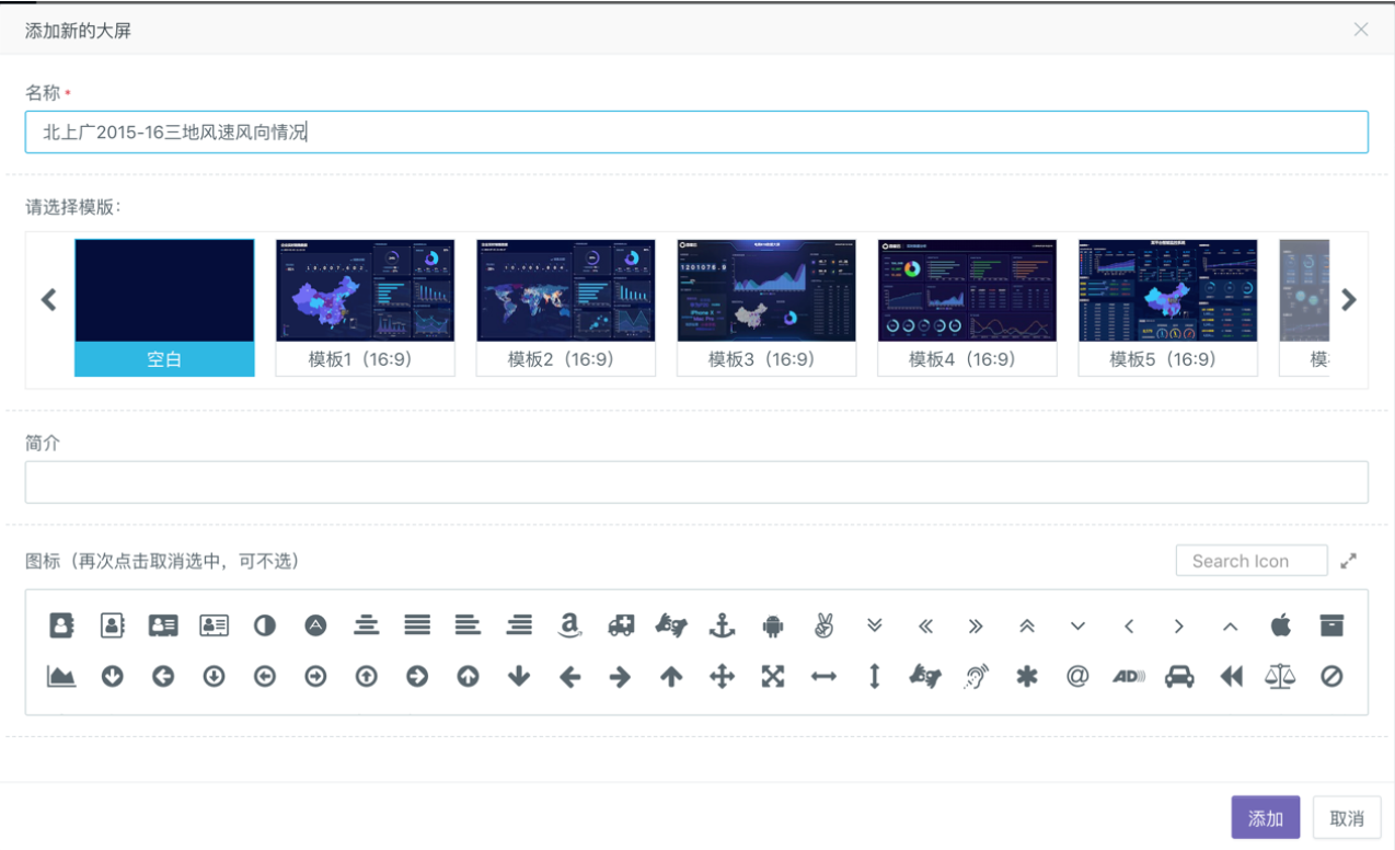
1.In the console on the left side of Sugar's 「Space Square」, click to enter 「System Settings」 > 「Large Screen Management」, then click 「Add New Large Screen」, enter custom information and select your favorite template to create a new large screen.
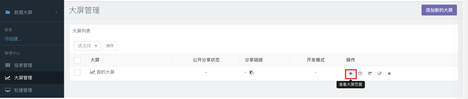
2.After the creation you can see the newly created large screen in the large screen list. Click the eye icon on the right to enter the large screen browsing page, and then click the Edit button in the upper right corner to enter the Edit mode.
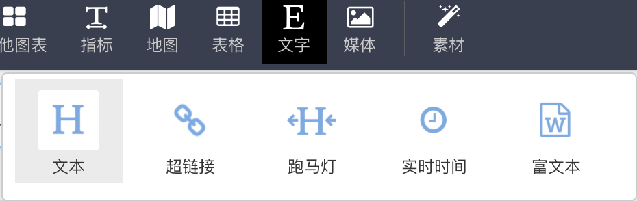
3.After entering the large screen editing page, create a new line chart, use the established SQL model (see the Report Example above) to Bind Data for the chart, and use the text tab in the toolbar to add appropriate titles to the report on the large screen after generating the chart. The example is as follows:
4.Now you can make some basic beautification for the whole interface, such as selecting the appropriate background for the whole large screen, typesetting the newly-built two line charts, and aligning them according to horizontal lines. After that, the example effects are as follows: