Data Visualization
Time Series Database (TSDB) of Baidu AI Cloud now provides two data visualization solutions, namely, IoT Visualization and Sugar, which can be flexibly selected according to your business requirements.
Application scenarios for two solutions are as follows:
- TSDB+IoT Visualization:
IoT Visualization is suitable for frontend developers to quickly build visualization applications, which can accelerate the development of frontend visualization. IoT Visualization, a visualization product provided by Baidu AI Cloud, is a visual designer based on IoT scenarios. You need not to deploy and install any plugins. It can directly dock TSDB and IoT Management of Baidu AI Cloud, support configuration and large-screen design. Furthermore, it can embed the designed panels through JS code into other visualization applications. For specific operations, please see [Operation Guide for IoT Visualization](IOTVIZ/Operation Guide/Create a new data table in the dashboard.md#New data table).
- TSDB+Sugar:
Sugar is an rapid BI and data visualization platform launched by the Baidu AI Cloud. It aims to solve the data visualization problems occurred in reports and large screens, and liberate the workforce of developing the data visualization system. Sugar provides users with an interactive design featured with the beautiful interface and amazing experience. You can build a data visualization page within 5 minutes through dragging and dropping chart components. The platform supports the direct connection to multiple data sources (i.e. Excel/CSV, MySQL, SQL Server, PostgreSQL, Hive, Spark, Presto, Teradata, Baidu Palo, Baidu TSDB, etc.). Additionally, it can be simply and flexibly bound to the data of visualization charts through API and static JSON. As a result, the chart data sources of the large screen and report can be reused, and the user can easily build different display forms for the same set of data.
This article focuses on the method of how to make visual demonstration for TSDB with Sugar. Users can take advantage of Sugar's visual capabilities to better analyze the data stored in TSDB in Baidu AI Cloud.
Instructions for use:
After TSDB has been connected to Baidu AI Cloud's Sugar, users can access TSDB through SugarBI and perform various interactive analyses of data stored in TSDB. Baidu AI Cloud’s Sugar provides the 30-day free full-featured trial for all our new and old users. After 30 days, you need to pay for use. For information on prices, please see Sugar Prices.
1. Create a Data Source
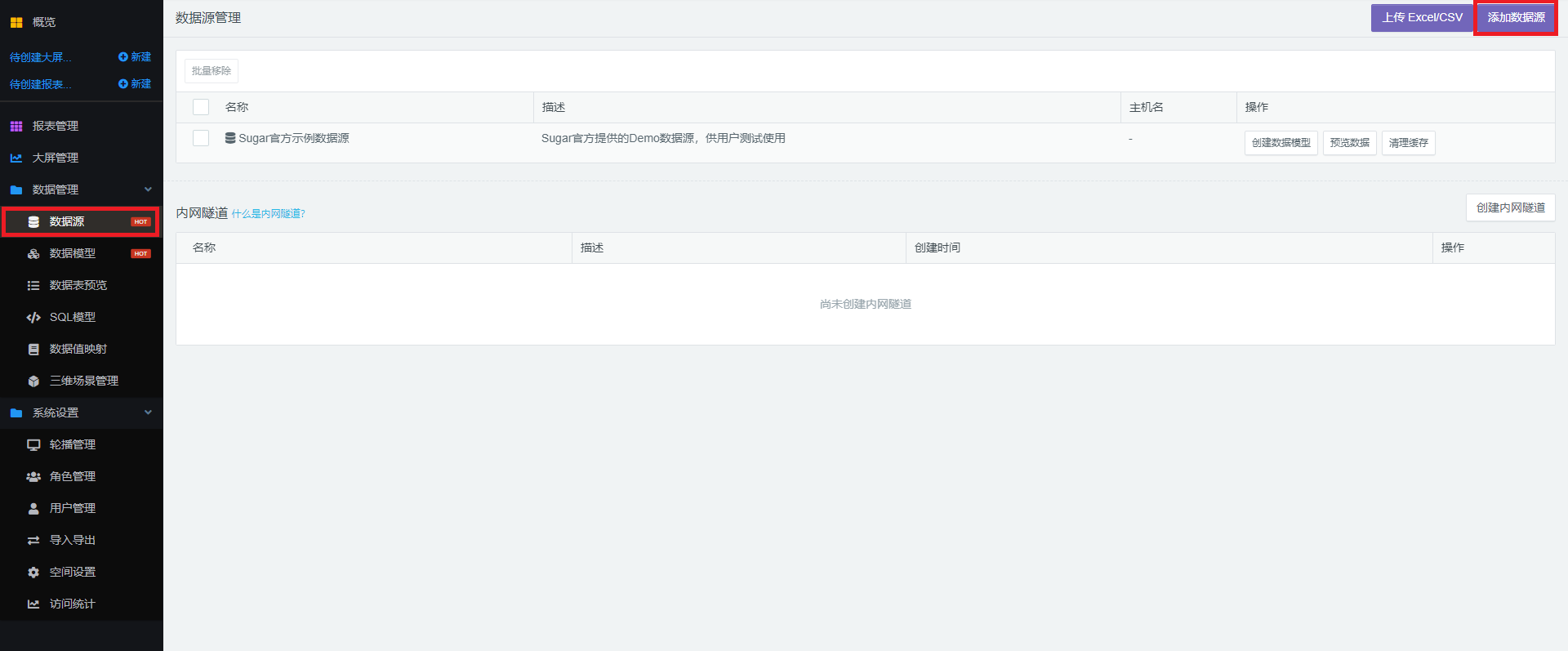
- Log in to Sugar to automatically enter the "Space Plaza", click on any place in "My Space" to enter the page of this space.
- Click "Data Management">"Data Source">"Add Data Source" on the left side of the space page to add a Baidu TSDB data source.
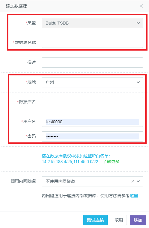
- In the data source edit box that pops up, select "Baidu TSDB" for the "Type". Afterwards, fill in the "Data Source Name" with the user-defined data source name, and the "Database Name" and "Region" with the name of the TSDB instance and local region that you want to access under the user name. Meanwhile, fill in the "User Name" and "Password" at the bottom with the information of the MySQL protocol account created by the user in TSDB. For specific operations of the MySQL protocol account created in TSDB, please see XXXX.
2. Report Examples
Next, we briefly explain how to make a report to analyze the data stored in TSDB.
Create a Report
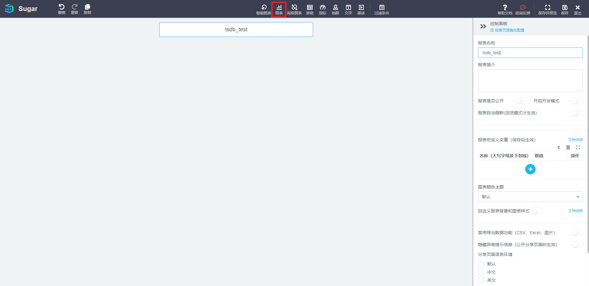
- First, enter the "Report Management" from the Console on the left to create a report page.
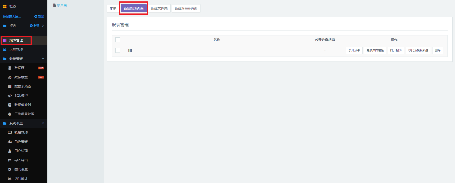
- In the list of "Report Management", select the report you want to edit, and click "Open Report" to enter the page of the report details.
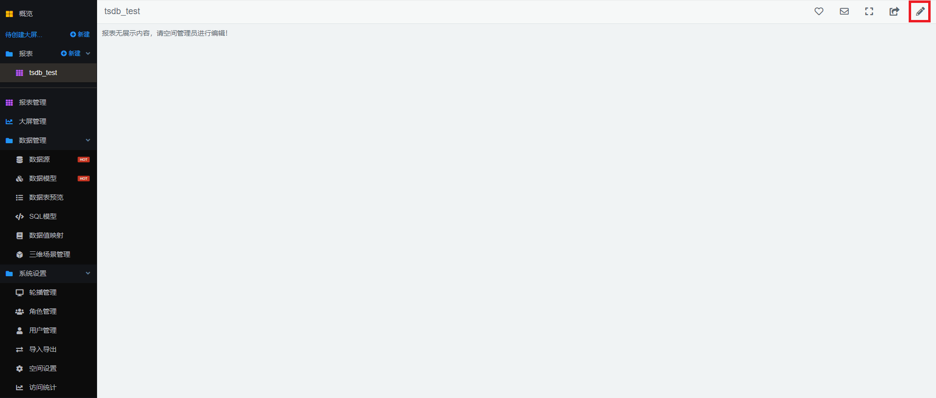
- On the page of the report details, click the Edit button in the upper right corner to enter the Edit mode.
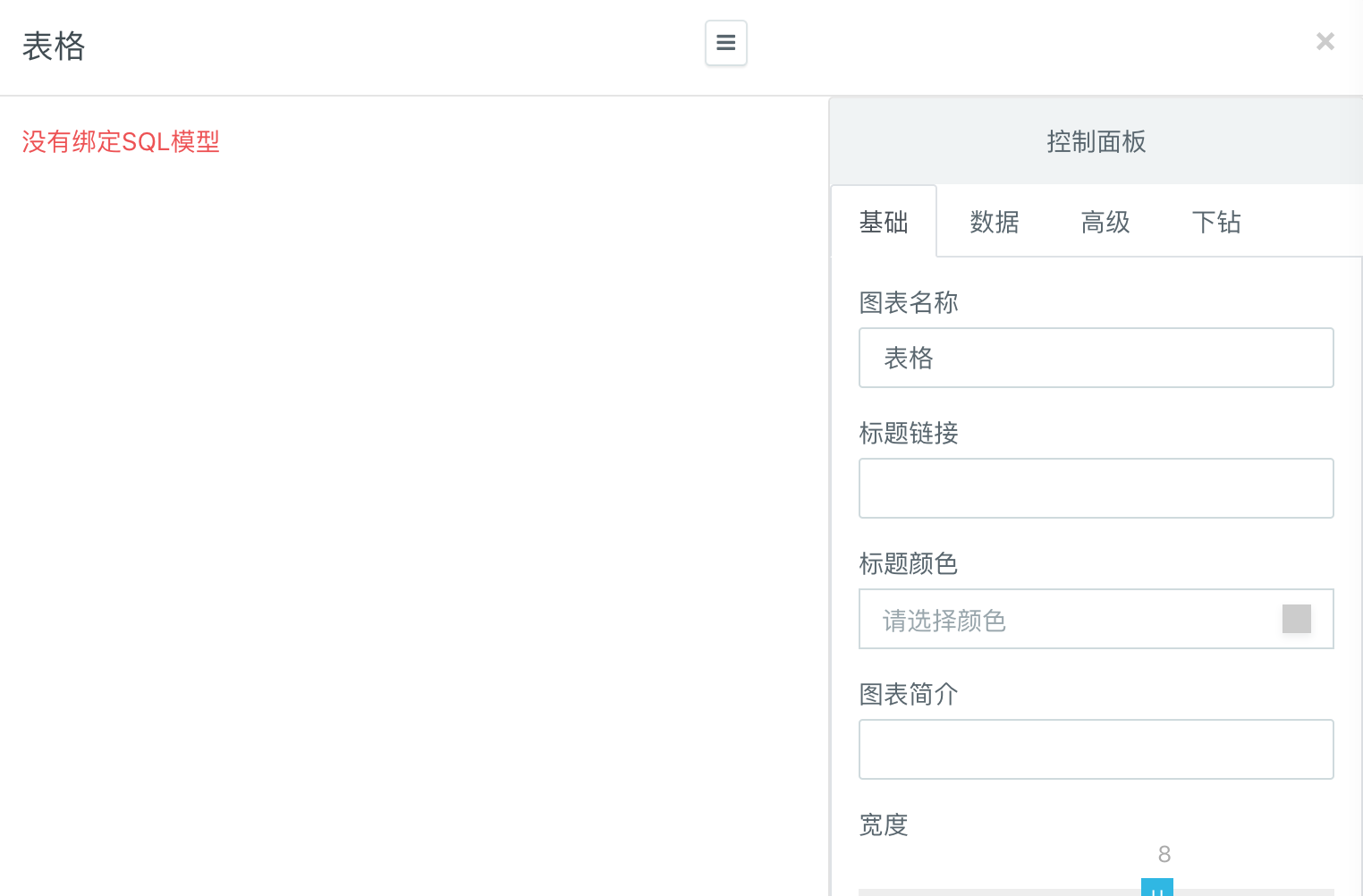
- Now, you can add your favorite chart and bind the SQL model to it to display your data. How to add a chart and bind data to the chart.
Example Applications
The example data sources we used herein include the wind-related weather simulation data (non-real data) collected at 8 AM every day in 2015 from all the air monitoring stations in Beijing, Shanghai, and Guangzhou. The data is stored in TSDB as follows. Wind serves as metric, which means that the wind-related weather data is stored in TSDB. There are two fields of speed and direction under metric, stores weather data about wind. There are two fields of speed and direction. The name and zip code of the city where each data point is located, and the geographic location (latitude and longitude) of the monitoring station corresponding to the data point serve as the tag.
Based on the above example data, we can make reports based on the following scenarios.
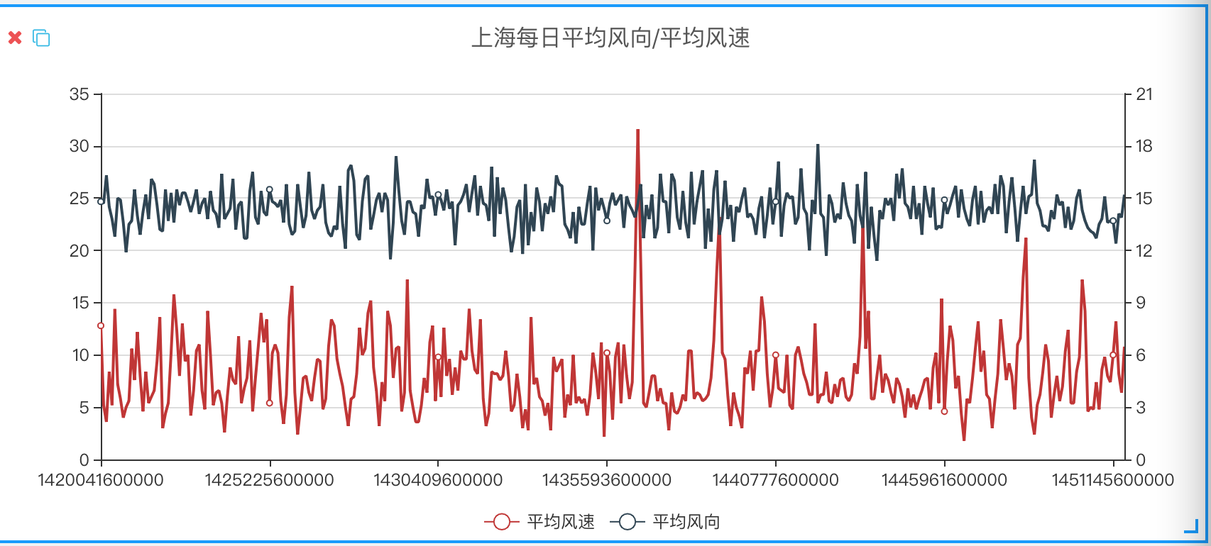
Scenario 1: Prepare a report to analyze the daily wind direction and average wind speed in Shanghai in 2015.
- First, create a chart. To observe the change trend, we choose the line chart herein.
- Create a SQL model in "Control Panel">"Data">"SQL Modeling" corresponding to the line chart.
- Enter the following SQL query statement in the edit box of the model and set up the field model.
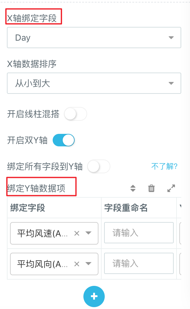
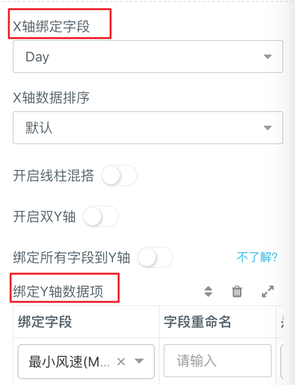
- Finally, go back to "Control Panel">"Data" to bind the corresponding data to the X-axis and Y-axis, and then click Refresh to generate the report we need.
select avg(speed) as Avg_Speed, avg(direction) as Avg_Direction,
 time_bucket(timestamp, '1 day') as Day
 from wind
 where city = '上海'
 group by time_bucket(timestamp, '1 day')
 order by time_bucket(timestamp, '1 day')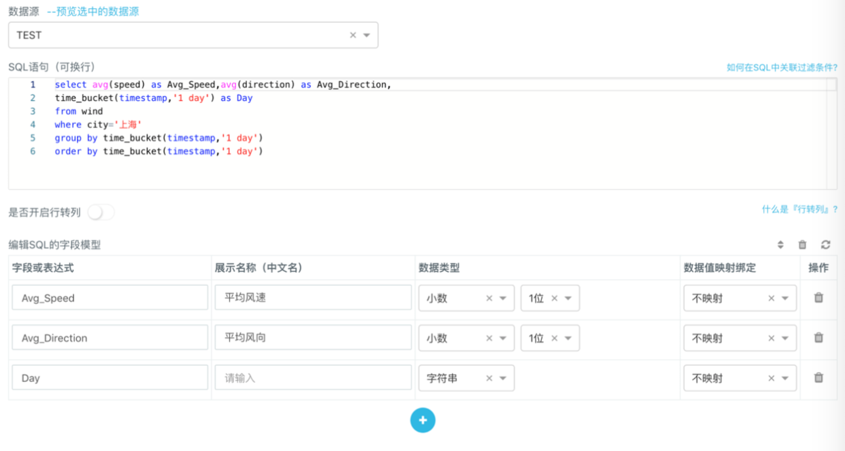
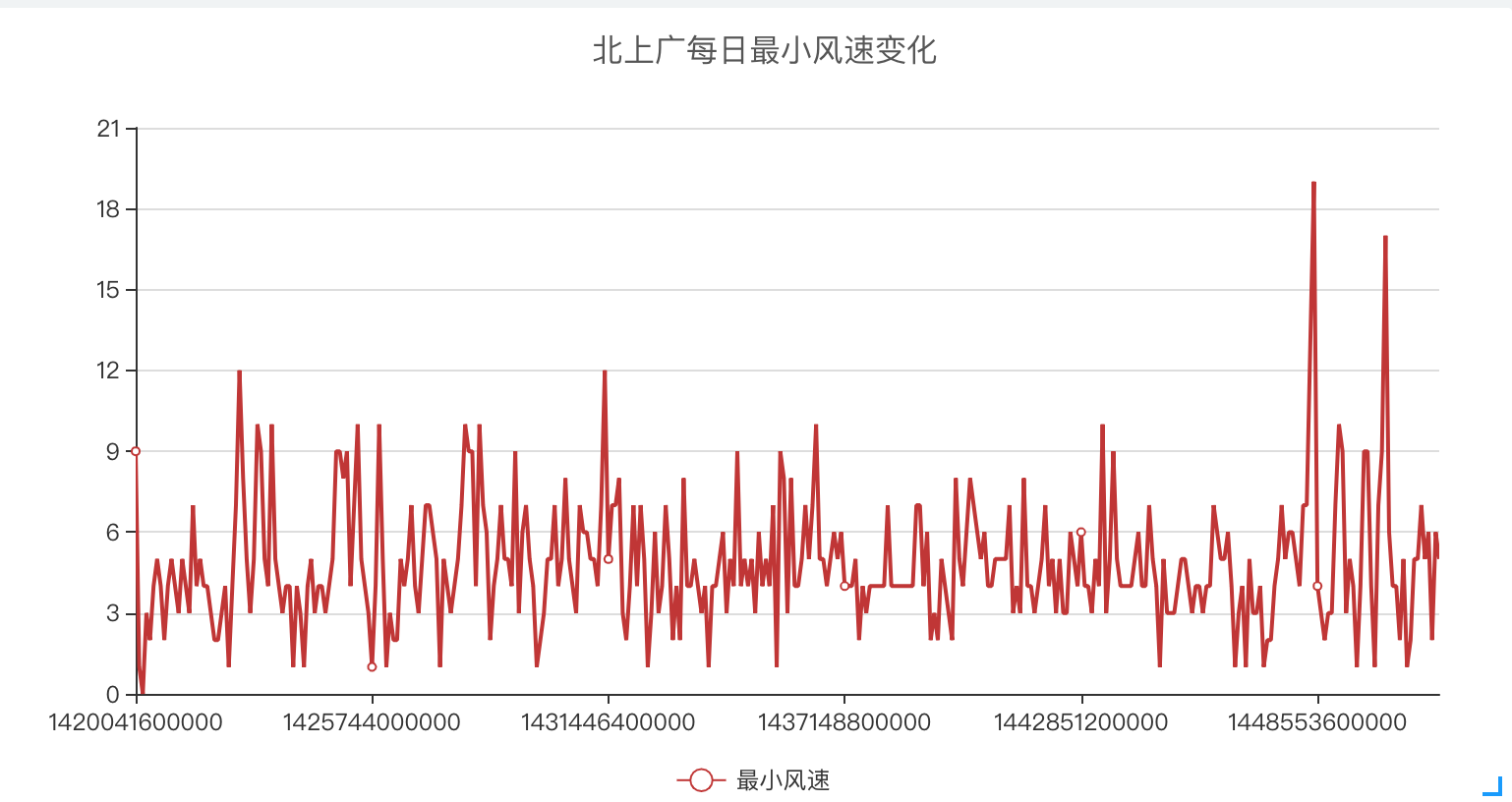
Scenario 2: Prepare a report to analyze the minimum daily wind speed collected from all the monitoring points in Beijing, Shanghai, and Guangzhou in 2015.
- First, create a chart. To observe the change trend, we choose the line chart herein.
- Create a SQL model in "Control Panel">"Data">"SQL Modeling" corresponding to the line chart.
- Enter the following SQL query statement in the edit box of the model and set up the field model.
- Finally, go back to "Control Panel">"Data" to bind the corresponding data to the X-axis and Y-axis, and then click Refresh to generate the report we need.
select min(speed) as Min_Speed, time_bucket(timestamp, '1 day') as Day
 from wind
 where city in ('Beijing','Shanghai','Guangzhou')
 group by time_bucket(timestamp, '1 day')
 order by time_bucket(timestamp, '1 day')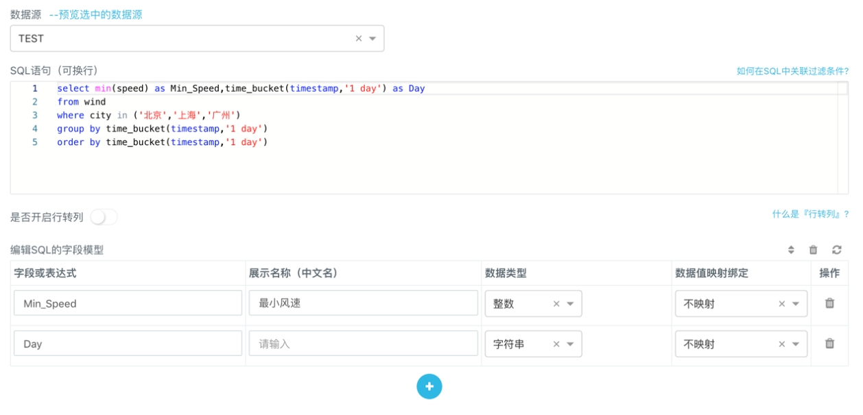
Aggregation Query
It should be noted that when the aggregation query is carried out, the field name during grouping must be matched with the time_bucket function, and the timestamp must be appropriately aggregated according to the data collection period. Otherwise, the generated chart may be interrupted unnecessarily and the change trend may not be displayed as required. In the above examples, the data collection period is once a day, so when the time_bucket is aggregated, a one-day period is selected to generate the continuous line chart.
time_bucket(timestamp, '1 day')3. Drill-down Examples
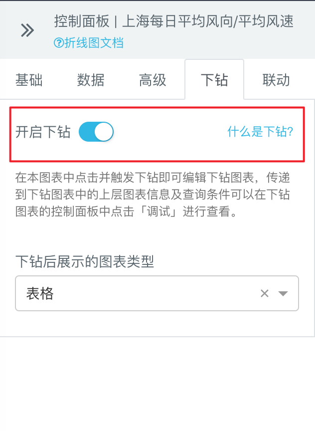
After the report is completed, the user can select a chart and click "Drill Down" to enable the drill-down function. "Drill Down" means that when you click on somewhere in a chart, another chart or hyperlink can be opened, and you can view the detailed information related to this part in the chart. Herein, we take the previously generated line chart of Shanghai's average wind speed and wind direction as an example to briefly explain how to perform drill-down.
- Click the line chart that you want to drill it down, go to "Control Panel">"Drill Down", and then click the tab in the right side of "Drill Down" to enable the drill-down function. Afterwards, set the type of the drill-down charts to the unified table.
Note: The line chart can only trigger the single type of drill-down, and special types of charts can trigger multiple types of drill-down.
- Click any point in the line chart to trigger the drill-down and open the display box of the drill-down data. The data obtained from drill-down is displayed on the left, and "Control Panel" which users can edit and set up is displayed on the right.
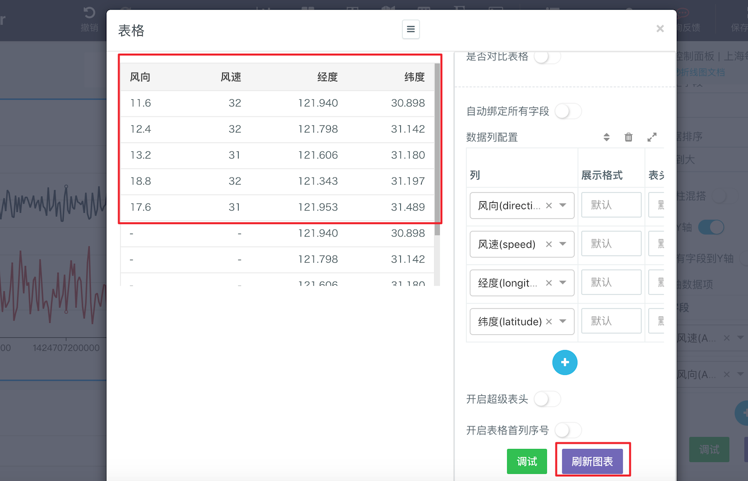
- Through “Drill Down”, although the current line chart only shows the average wind speed and wind direction of Shanghai, we can view the wind speed and wind direction collected from each monitoring point in Shanghai
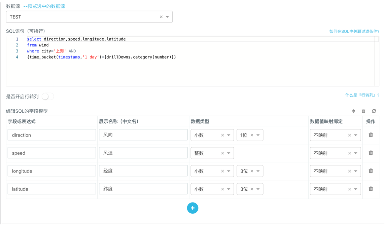
timestampcorresponding to any data point which is selected in chart. Let’s take the following case as an example. Select any data point oftimestamp=1436544000000, and create a SQL model in the popup down-drill through "Control Panel">"Data">"SQL Modeling". Enter the following SQL query statement in the edit box of the model and set up the field model.
select direction, speed, longitude, latitude
from wind
where city='上海' AND time_bucket(timestamp, '1 day') = 1436544000000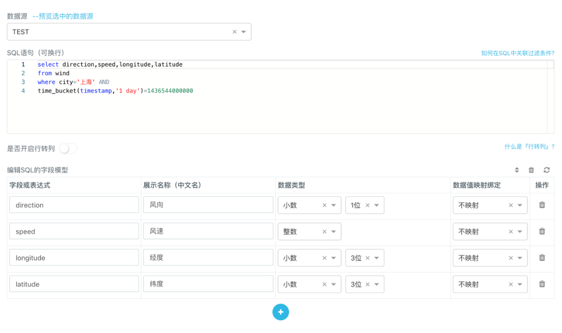 In the line chart example,
 timestamp has been aggregated according to the time_bucket function. Therefore, when the drill-down modeling is performed, the filtering condition by timestamp needs to be changed into the filtering condition by time_bucket function. Otherwise the data cannot be inquired.
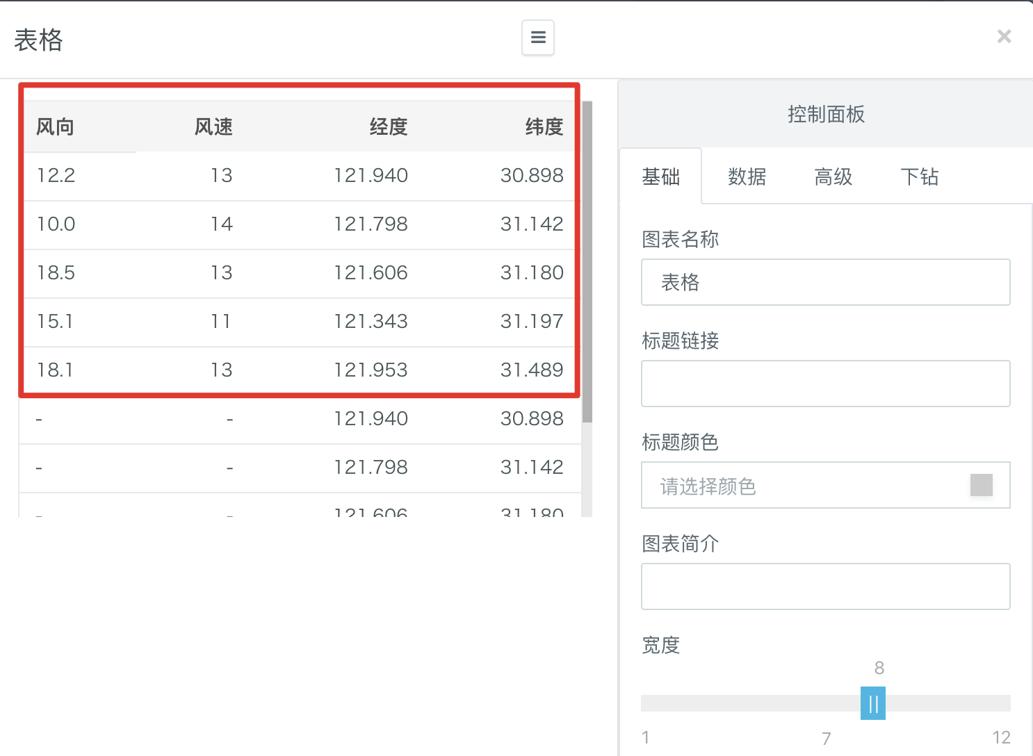
time_bucket(timestamp, '1 day') = 1436544000000- After the chart is refreshed, you can see the wind speed and wind direction respectively collected from a total of 5 monitoring points in Shanghai on the left on the date when
timestamp=1436544000000:
- It is convenient that we can build the SQL model for drill-down with drill-down parameters. For example, we can replace the previously constant
timestampwith thecategoryvariable indrillDowns. After such modification, only after you select any point on the line chart, the chart showing the drill-down data is going to refresh itself automatically according to thetimestampof the selected point. Meanwhile, the wind speed and wind direction collected from all the monitoring points in Shanghai are going to be generated in the correspondingtimestampwithout modification of the SQL statement.
select direction, speed, longitude, latitude
 from wind
 where city='上海' AND
 {time_bucket(timestamp, '1 day')=[drillDowns.category(number)]}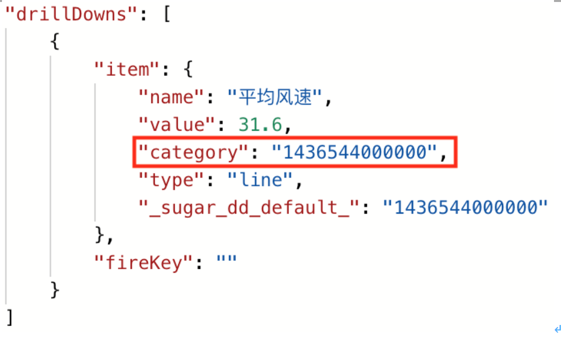
For example, select any data point when timestamp=1420041600000, and click Trigger Drill-down. The popup data display box shows the wind speed and wind direction collected from a total of 5 monitoring points in Shanghai on the date when timestamp=1420041600000 without manual update of the timestamp value in the SQL model.
4. Large Screen Display Examples
We briefly introduce how to display the report on a large screen. For more information on the detailed tutorial, please see the Large Screen Preparation.
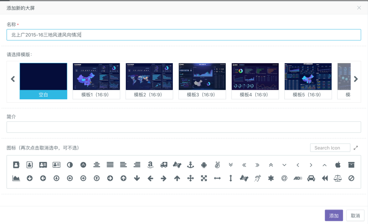
- Click the Console on the left of Sugar’s "Space Plaza" to enter "System Settings”> "Large Screen Management". Afterwards, click "Add Large Screen", enter custom information and select your favorite template to create a large screen.
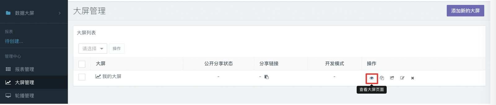
- After the large screen is created, you can see the newly created large screen in the list of large screens. Click the eye icon on the right to enter the large-screen browsing page, and then the Edit button in the upper right corner to enter the Edit mode.
- After you enter the large screen-editing page, create a line chart, and bind data to the chart with the created SQL model (see the report example above). After the chart is generated, add a title to the report on the large screen with the text option in the toolbar. The example is as follows:
- At this time, you can beautify the entire interface at the basic level. For example, selecting a background for the entire large screen, laying out the two new line charts, and aligning them according to the horizontal line. The effect diagram of the sorted example is shown as follows: