
Make report
Last Updated:2020-11-17
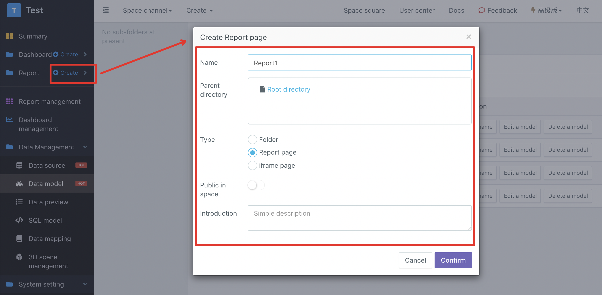
Create a report
You can quickly create a report in the left navigation of the space:
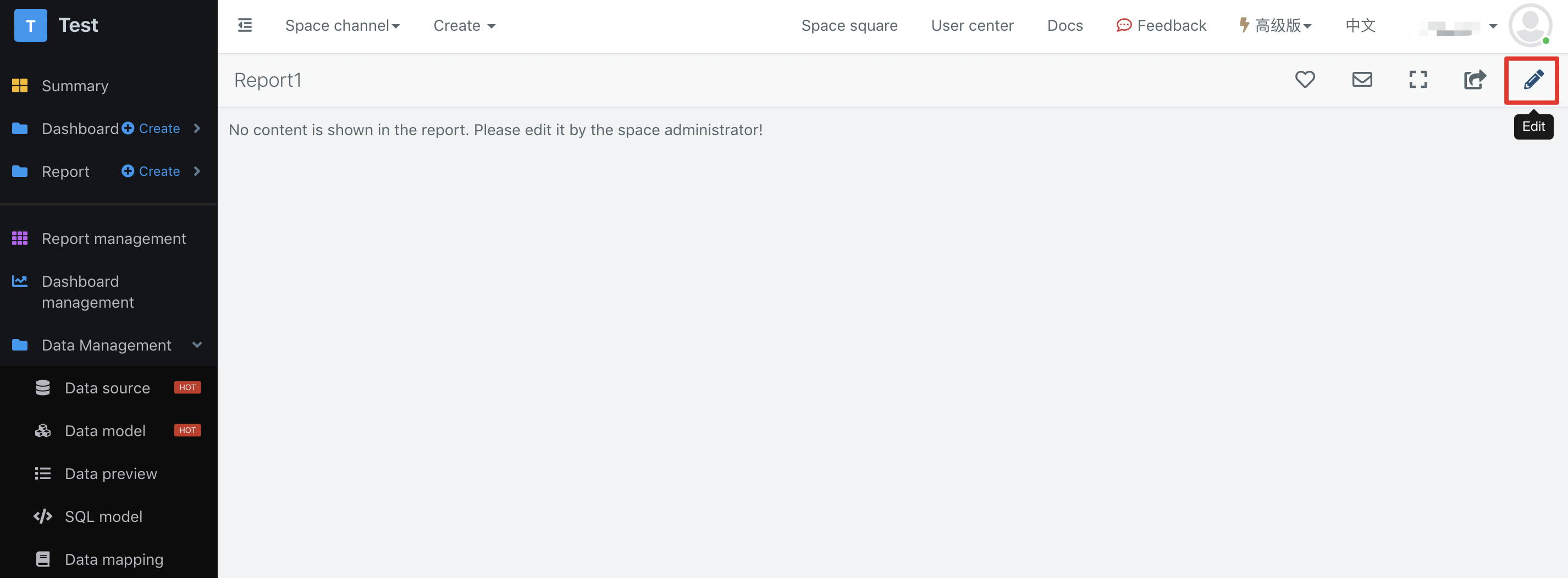
After that, you will enter the new report page, and click the "Edit" button on the upper right side of the page to make the report:
Add chart and bind data
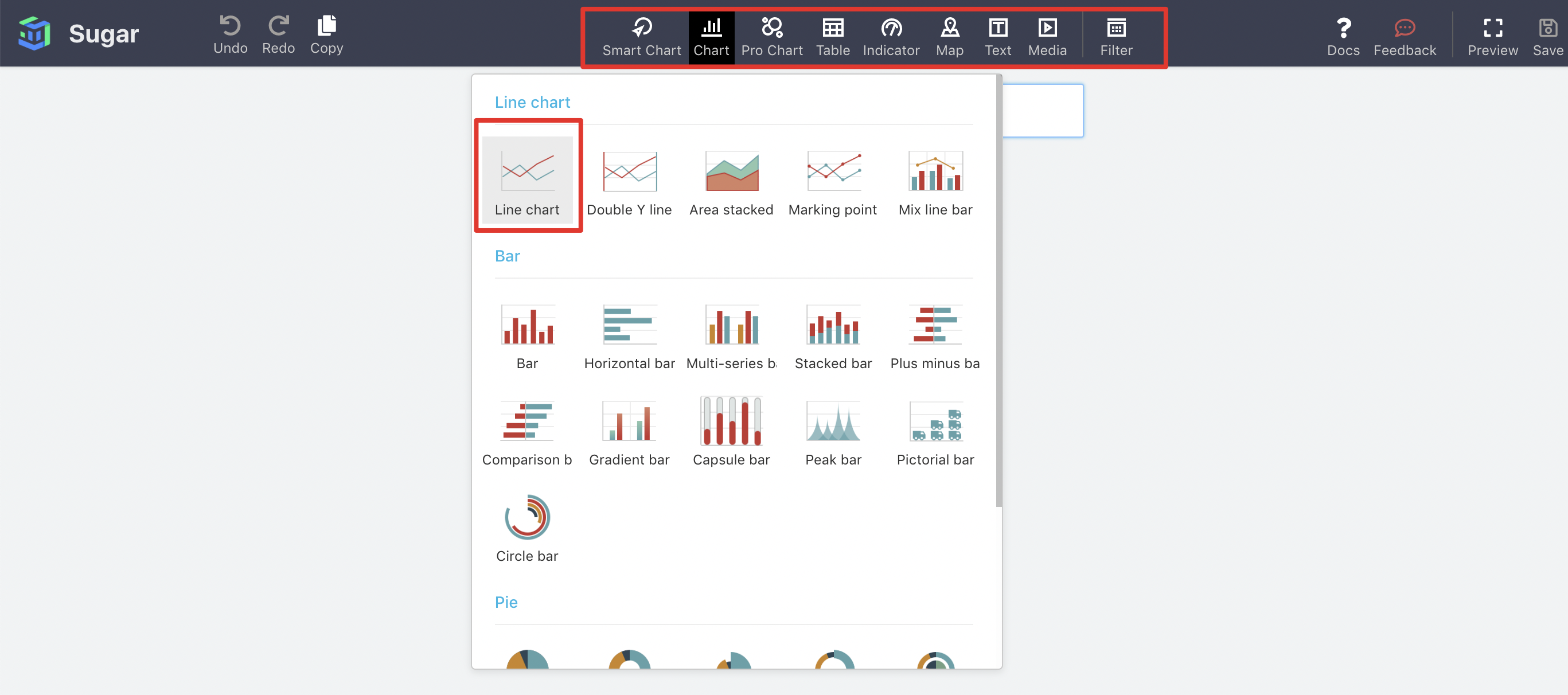
In the report editor, you can add a new chart (such as line chart) through the toolbar at the top of the page:
Then, you can bind the fields in the data model to the line chart for visualization as follows:
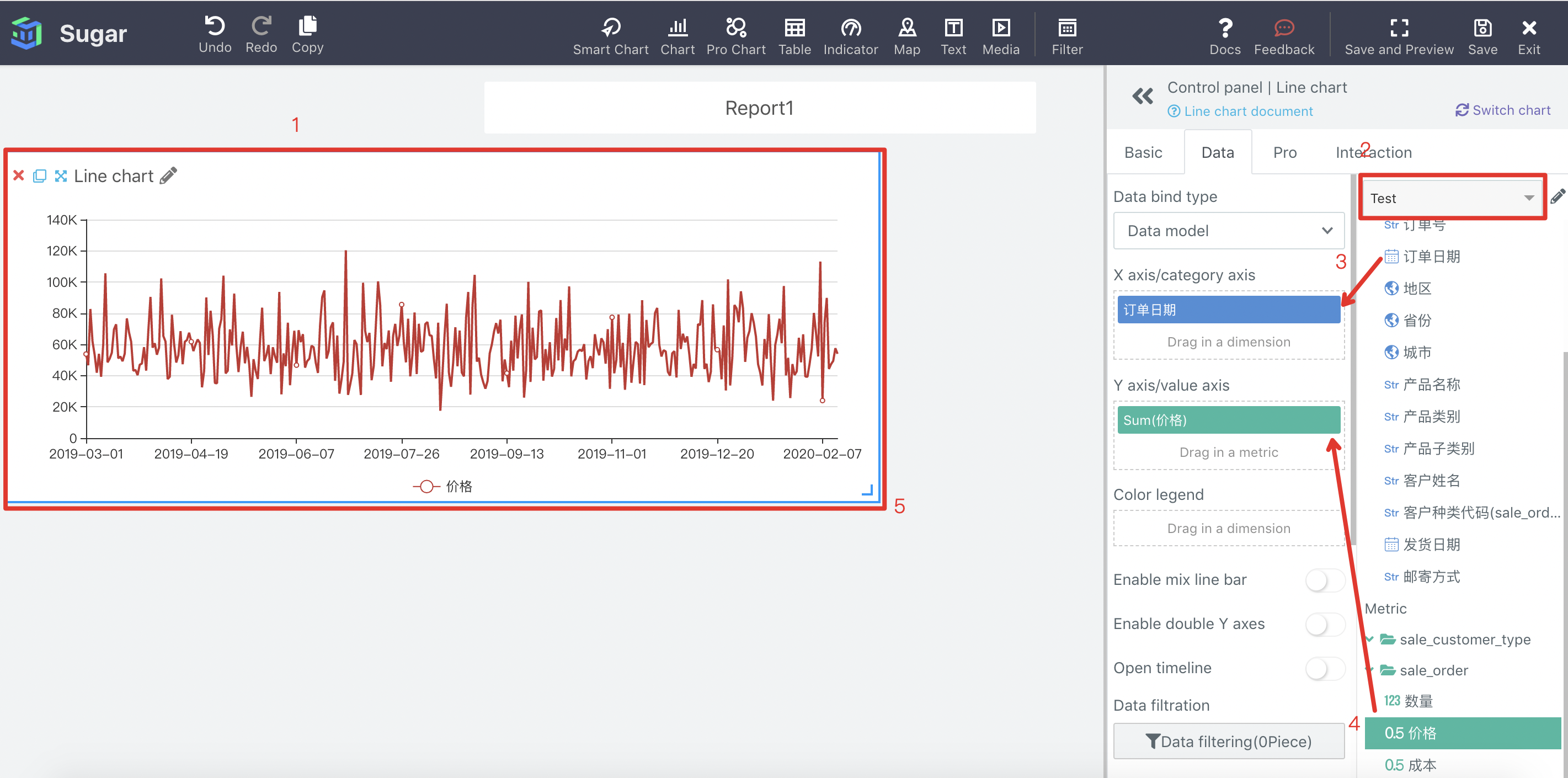
- Click to select the line chart to be operated, and the "control panel" on the right side of the page will display the configuration items of the line chart
- Select the data model you want to use
- Drag the order date field to the x-axis
- Drag the price field to the Y axis
- You can also drag and resize the chart. You can also add other charts to the page, just like the above line chart.
Finally, you need to click "save" and "exit" in the upper right corner of the page.