
Data model
After connecting the data source, you can associate the multiple data tables you need into a wide table, and perform the required data processing (such as field rename, new calculation field, create level, adjust field order, etc.), and establish a data model to facilitate the subsequent data visual analysis.
New Data Model
On the data model page in the space, you can create a data model, select the data source you want to connect to, and enter the name of the data model:
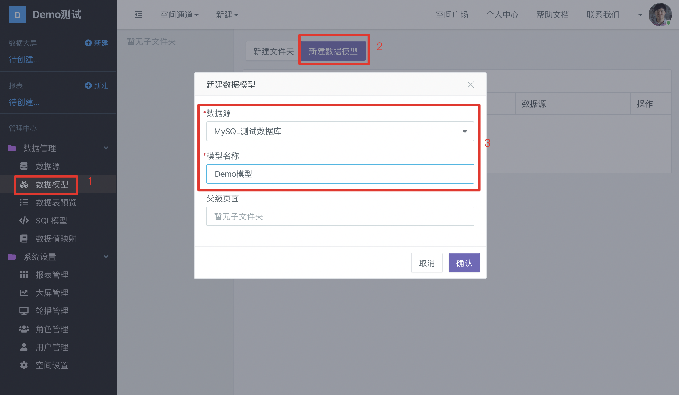
In the data model page, you can also manage all models in the space, such as creating folders, moving models to specified folders, sorting data models, etc.
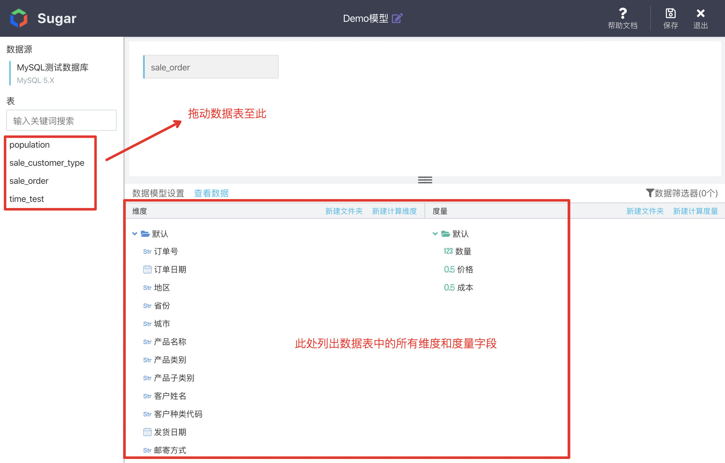
Add Data Table
In the previous step, after creating a new data model, you will enter the editing page of the model. All data tables in the data source will be listed on the left side of the page. Drag the data table to be analyzed to the middle area of the page:
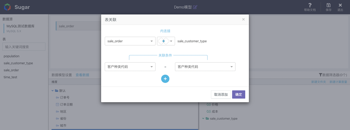
Multi Table Association
When multiple data tables are dragged in, association analysis of multiple tables (corresponding to multi table join in SQL statement) can be realized. When multiple tables are associated, you need to select the fields associated with two tables and the associated types (inner join ,full join and left join are currently supported):
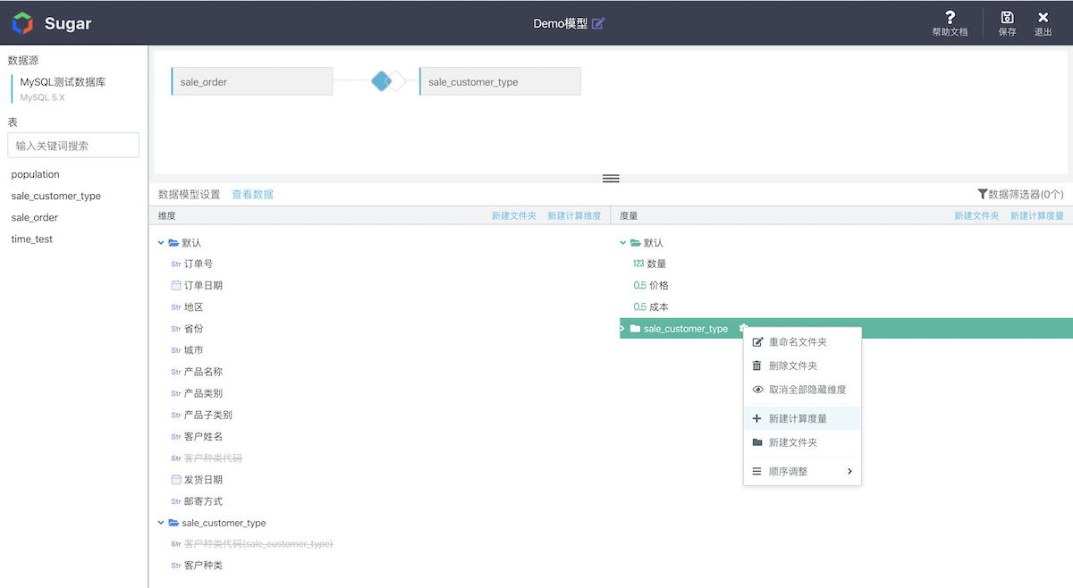
After the association of two tables is set, the dimensions and measures will be listed in the form of folders. Each dimension, measure and folder can be added, deleted or modified by right clicking, and can also be dragged to adjust the order or hide some words that are not used in analysis
What are Dimensions and Measures
Dimensions: granularity when analyzing data
Measurement: aggregate aggregate aggregate of indicators
Aggregation method: aggregation method, such as sum, mean, maximum and minimum
For example, the sales order data in our official sample data source:
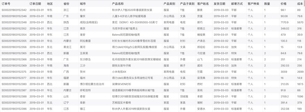
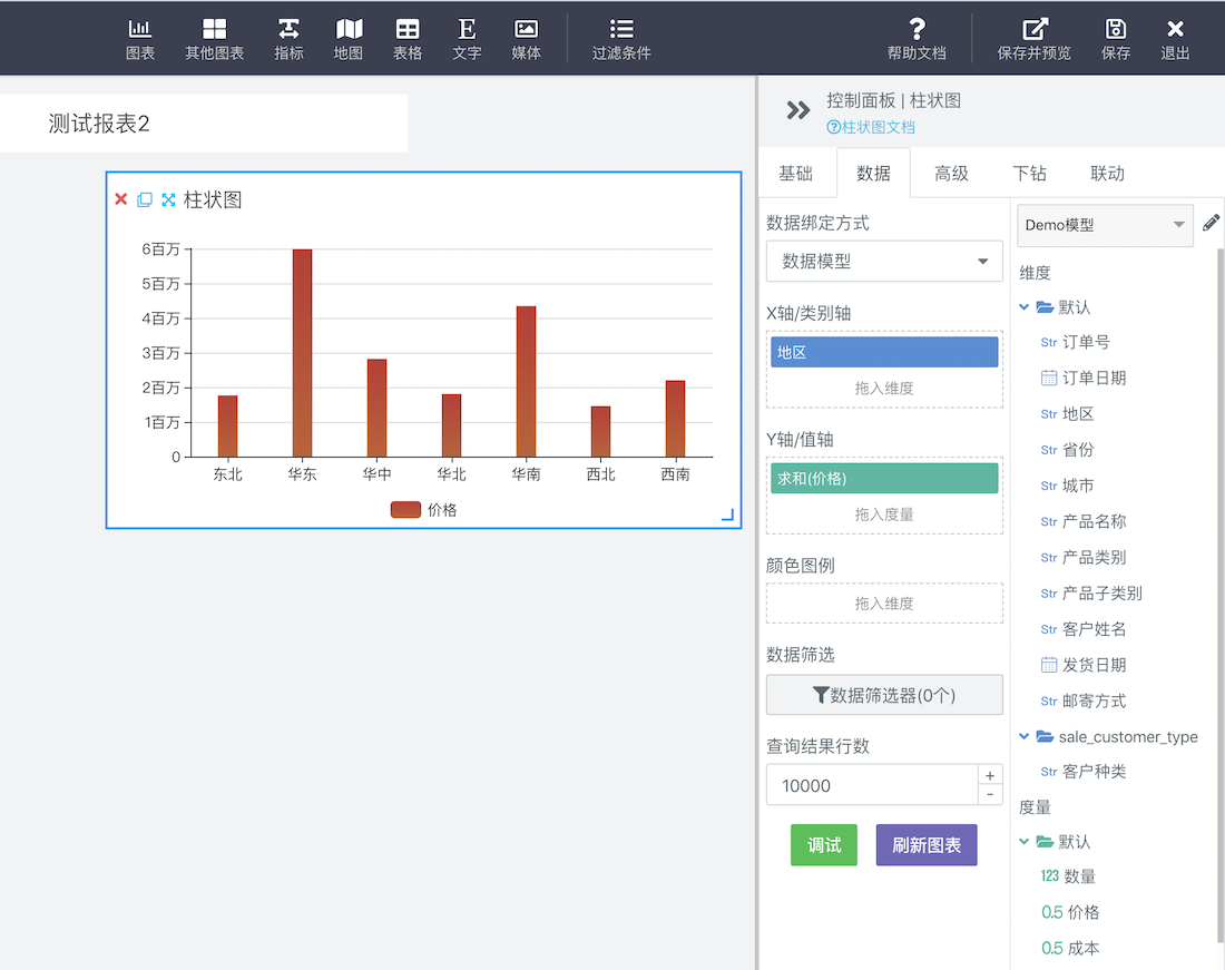
For example, when we analyze the "sales price of each region", the "region" is the dimension, and the "price" is the measurement. Each region has hundreds of rows of data. We sum and summarize these data. As shown in the figure below:
By default, Sugar will classify fields of character type as dimensions and fields of numerical type as metrics. Users can also manually change the type of fields.
Custom SQL View
If your data model requirements are complex, for example, you need to use subquery, union, complex data filtering, etc., you can create custom SQL views using SQL statements.
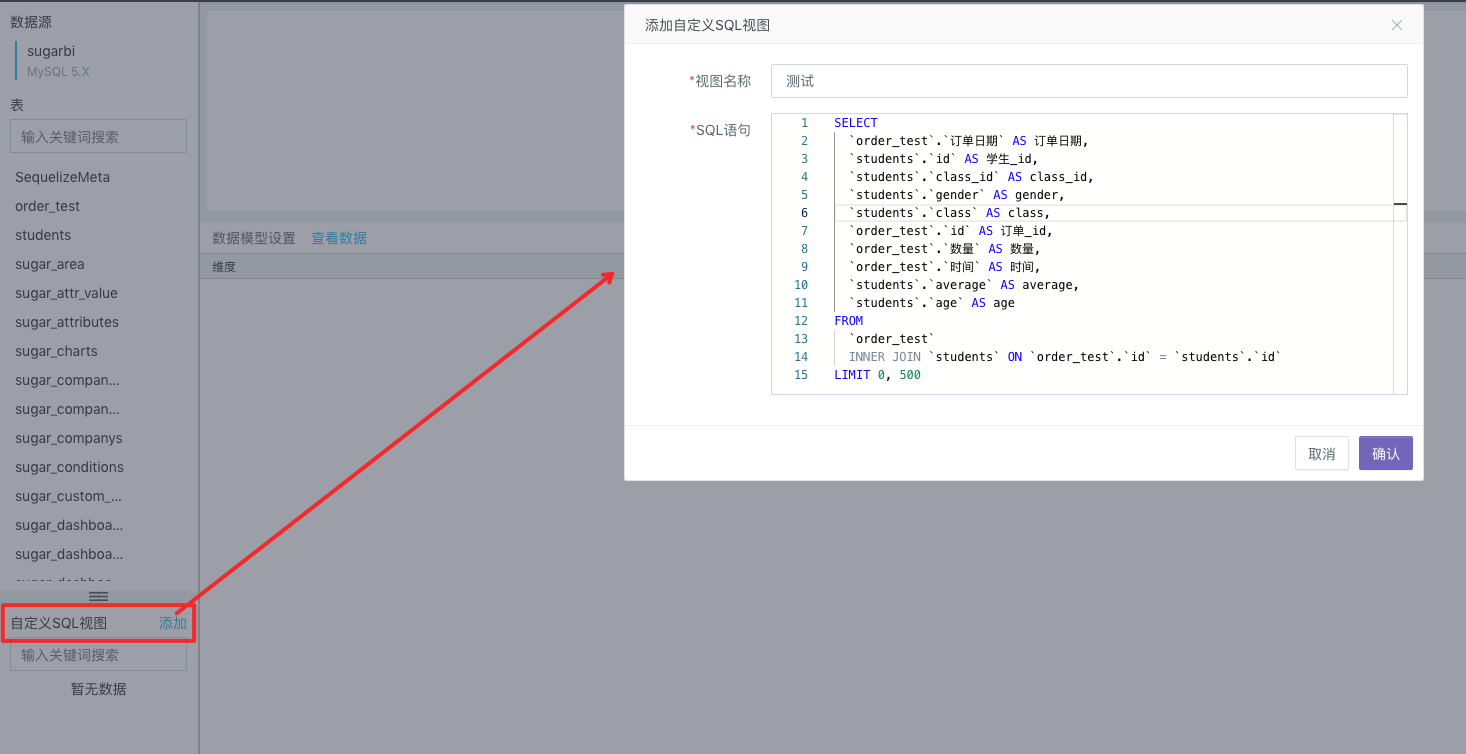
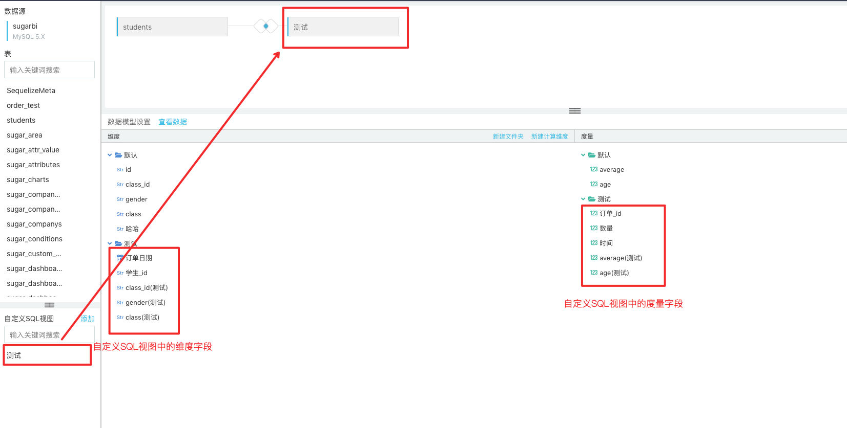
Users can write SQL statements to create a custom SQL view. The successfully created SQL view will appear in the Custom SQL View at the bottom right of the page. Afterwards, you can, just like operating the data tables in the data source, drag it to the center of the page to conduct association analysis with the data tables in the data source or other custom SQL views.
You can preview your desired data structure by moving your mouse onto the custom SQL view or data table and click the View button.
Calculation Field
In some cases, when analyzing, you need to add, subtract, multiply and divide multiple fields, and some SQL function calculations (such as CONCAT、DATEDIFF、ADDDATE, etc.) to form a new calculation field. In Sugar, you can create new calculation fields for both measurement and dimension

Note: In the computed fields, SQL expressions, instead of a complete "select" query statement, should be filled in.
Data Type Conversion
In Sugar, data classes that support conversion of fields, such as 20200108 of string type, are converted to standardized date types so that we will treat them as date types for later data analysis, calculation and display.

Data Filtering
When creating a data model, for example, we want this data model to be used only to analyze the data in the "northeast" region, and do not care about the data in other regions. The data filter can be set for the model:

Click "data filter" in the figure above, and add a new filter to restrict the "region" field. Check "northeast" only.

After adding the filter, click "query data" in the middle of the page, you can only see the data of "northeast" region, and then the data visualization analysis based on the data model will only query the data of "northeast" region.
For more information on data filters, see [data filtering](Sugar/operation guide/visual analysis/ data filtering.md).
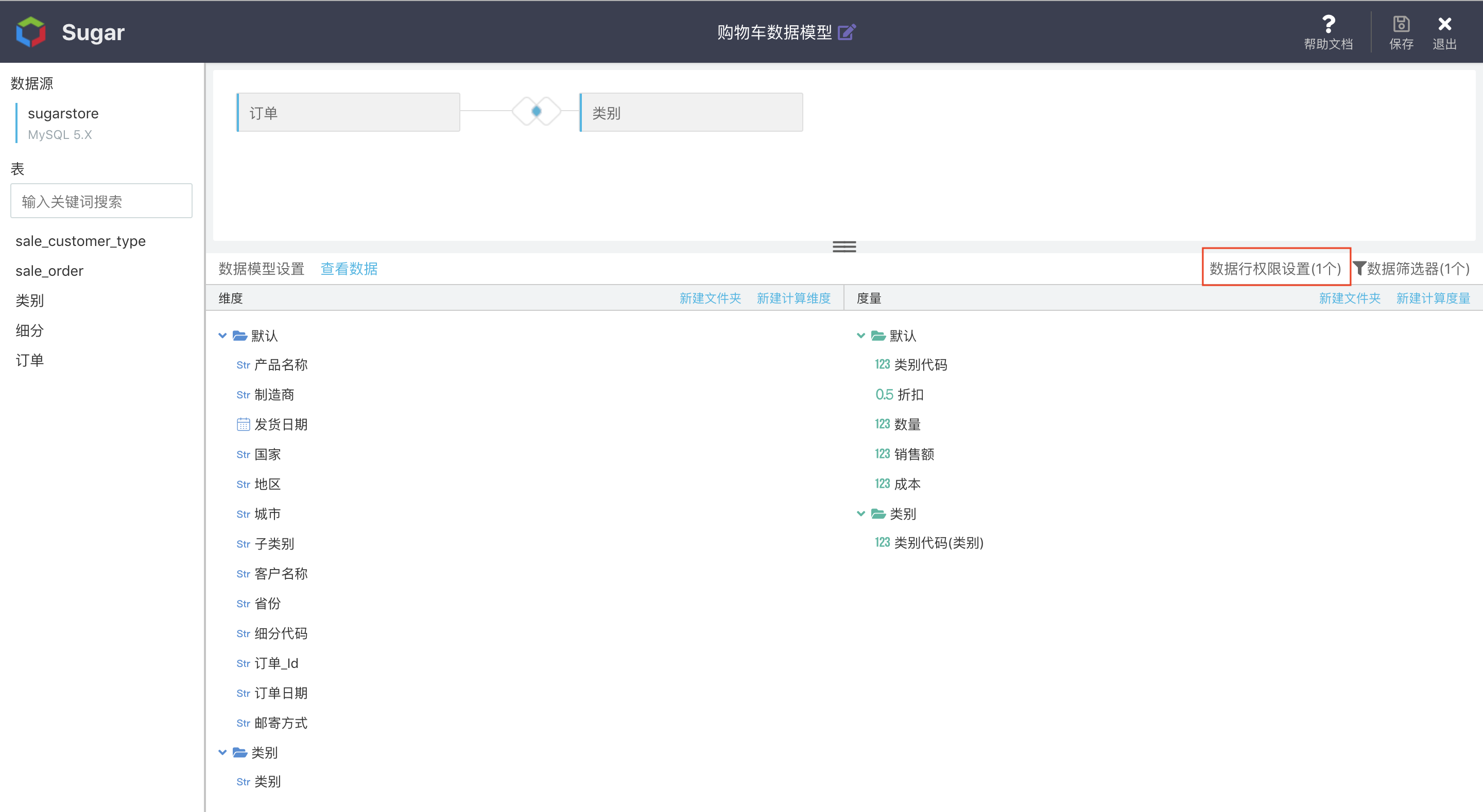
Row-Level Permission
To allow different people to use a same report or large screen, we can see different data. E.g.: Employees of Guangdong Province can only see the data of Guangdong Province, while employees of Beijing municipal can only see the data of Beijing. We can conduct [Data Row Permission Settings] for this model:
For more information about Row Level Privilege, please refer to Row Level Privilege Management
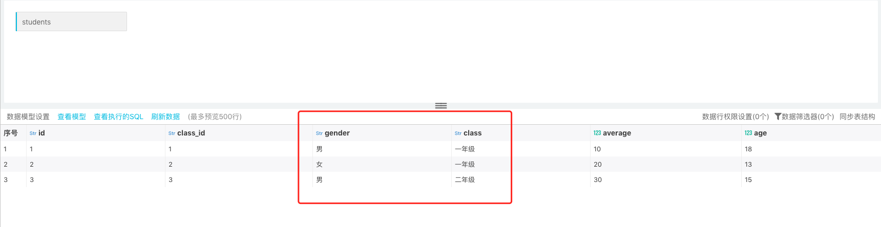
Synchronizing Table Structure
In report production process, if source table field changes, it can be configured by synchronizing table structure feature. For example:
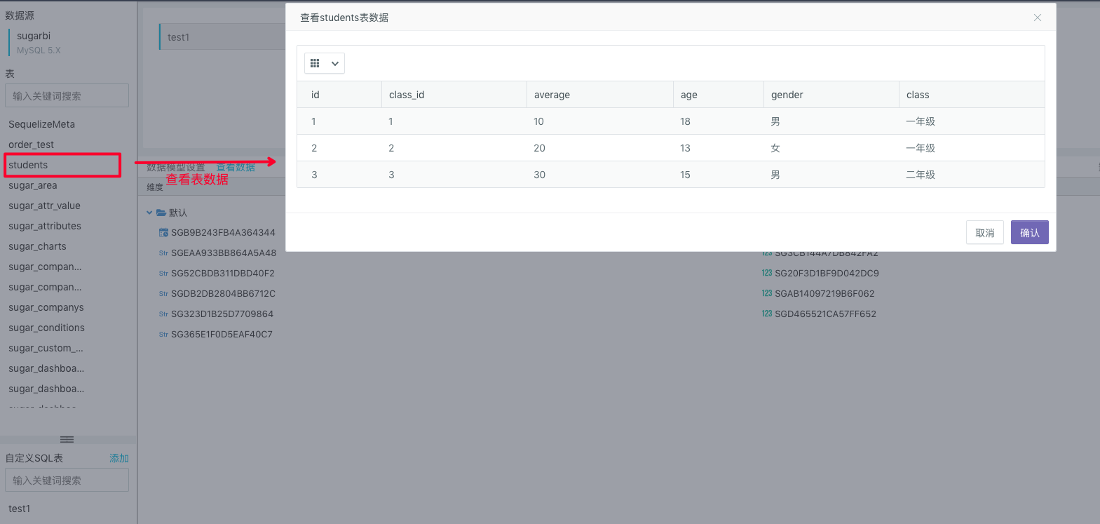
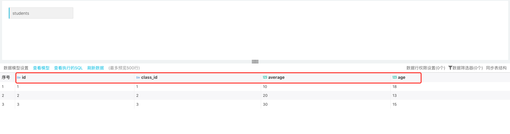
In the figure below, the source table is "students". It has four fields: id, class_id, average, and age. Creating data set:
In later stage, the fields "gender" and "class " are added to the source table. Now, you just need to synchronize newly added fields into the table structure of the original dataset:
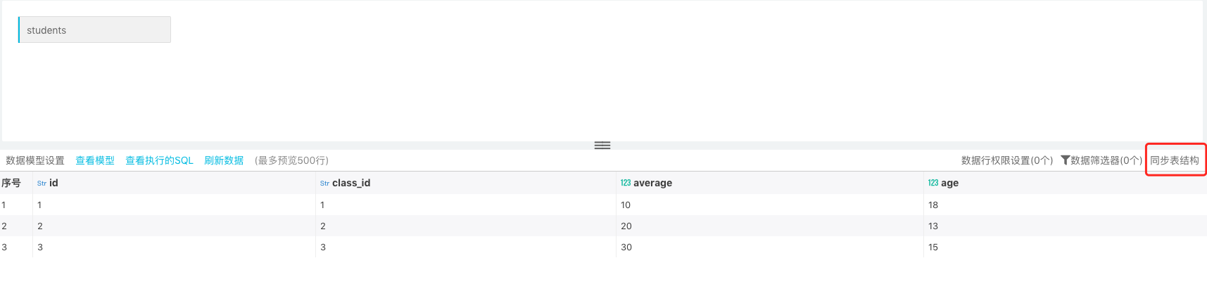
After synchronizing the table structure -> refresh data, now the new fields and data are updated in the data table.
Note: Synchronizing table structure will only synchronize the newly added fields in the data table. The deleted fields and changed field type in the data table will not be synchronized