
Management Dashboard Charts
Basic concepts
| Term | Description |
|---|---|
| Chart Type | Choose the trend chart display format, which can include tables, line charts, data panels, or pie charts. |
| Decimal places | Allows custom configuration for the number of decimal places to display. |
| Null value processing | Specify how to handle null data in charts. For line charts, you can select 0 value display, connections, or breakpoints. |
| Threshold | |
| Field attributes |
Create dashboard and charts
New chart group
- Select "Dashboard" from the left navigation bar to enter the Dashboard List page.
- Click on the dashboard name to navigate to its details page.
- In the dashboard details page, click the Chart Group button in the upper right to create a new chart group. Redirect to the configuration chart page by clicking the new chart group
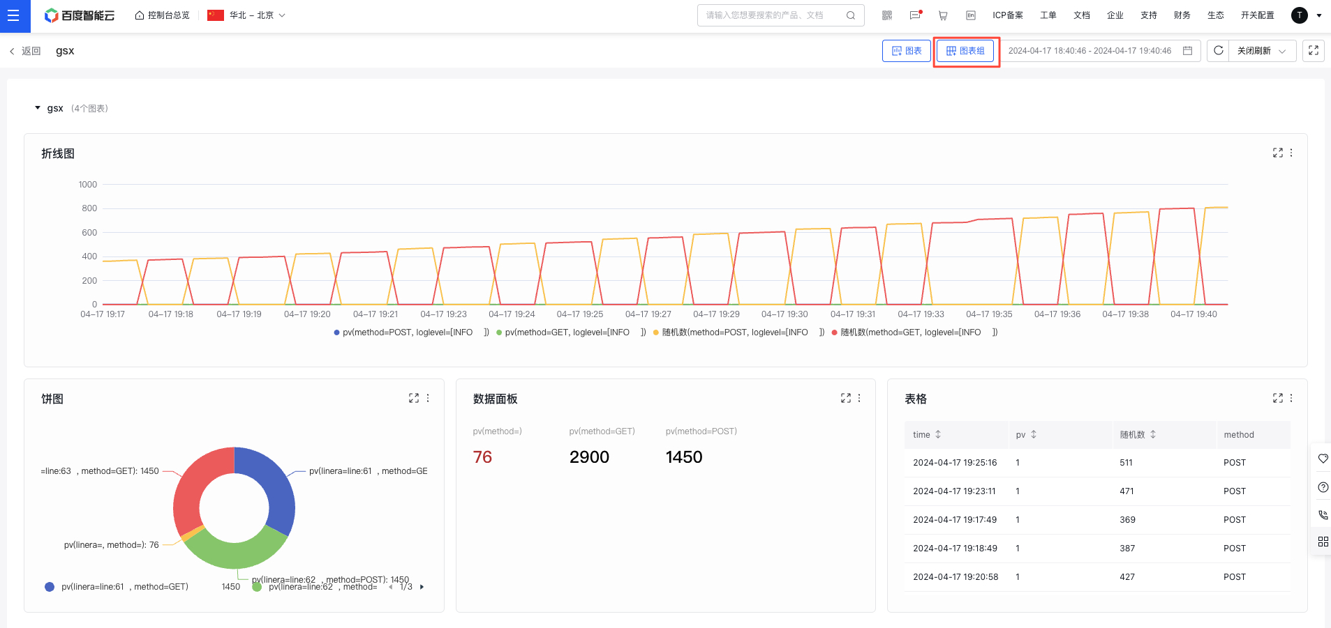
- Hover over a chart group to enable editing or deletion operations; hold and drag the chart group to sort them
New chart
- Select "Dashboard" from the left navigation bar to enter the Dashboard List page.
- Click on the dashboard name to navigate to its details page.
- In the dashboard details page, click the Chart button in the upper right to create a new chart. Redirect to the configuration chart page by clicking the new chart
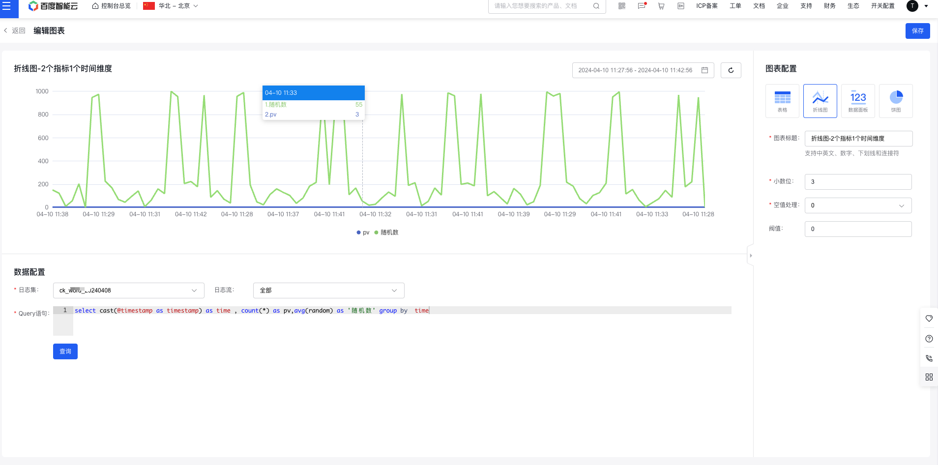
- Select the chart type and configure the chart data
- Configure data
Select a LogStore, configure a query statement for statistical analysis using SQL
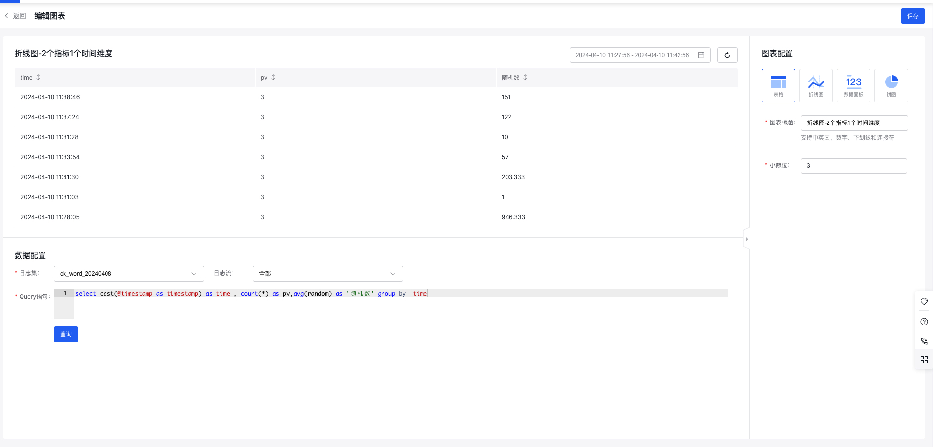
- Table
Tables are a commonly used data display format, allowing for structured data organization to facilitate comparisons and statistical analysis. They are suitable for most scenarios.
Table configuration item includes decimal places, unit configuration, etc., with a preview on the left
- Line chart
Line charts are useful for visualizing statistical data with time-series fields, organizing and aggregating metrics over time. They clearly illustrate trends in metrics across a given period, making them ideal for trend analysis scenarios, such as tracking error counts over time. Line charts can also display data for multiple metrics across multiple dimensions.
Line chart configuration item includes decimal places, unit configuration, null value processing, threshold, etc., with a preview on the left
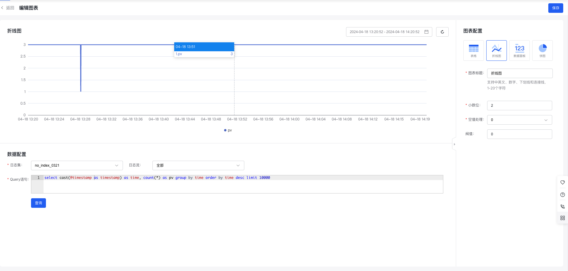
Note: Line charts require time fields and rely on various functions to process the time field. For more time-series functions, refer to Time Functions
- Statement example: Calculate PV per minute
- select histogram(cast(@timestamp as timestamp), interval 1 minute) as time, count(*) as pv group by time order by time desc limit 10000
- Note: @timestamp string type needs to be converted to a timestamp type
- Data panel
The data panel is primarily used to present key business metrics. It is suitable for displaying numerical statistics of metrics over specific periods, such as daily, weekly, or monthly PV and UV. It also supports visualizing data from multiple metrics across various dimensions.
Data panel configuration item includes decimal places, unit configuration, threshold, etc., with a preview on the left
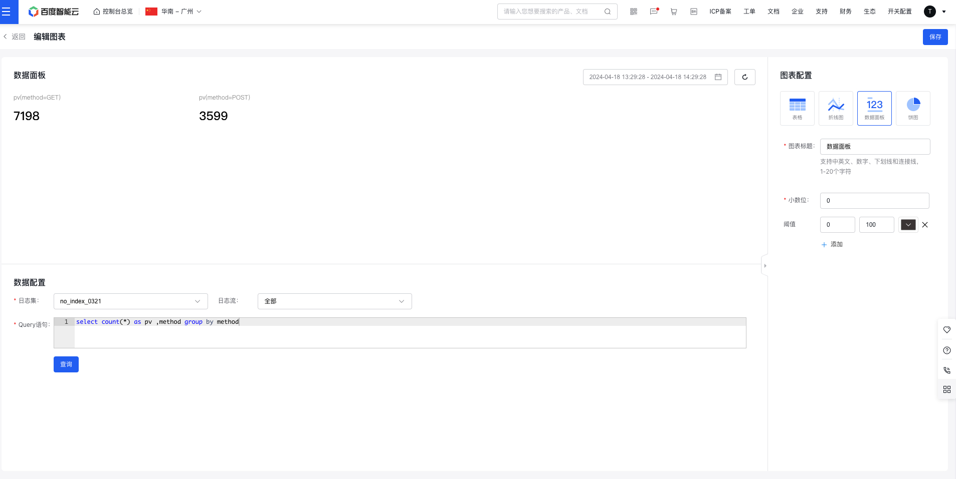
- Statement example: Calculate PV by methods
- select count(*) as pv ,method group by method
- Pie chart
Pie charts provide a visual representation of category proportions, where the size of each sector reflects the relative proportion of each category. They are ideal for proportion analysis scenarios, such as examining the distribution of error codes. Pie charts can display data for a single metric across multiple dimensions.
Pie chart configuration item includes decimal places, unit settings, display methods, item grouping (top X individual items + remaining items as "other"), and display item settings, with a preview on the left
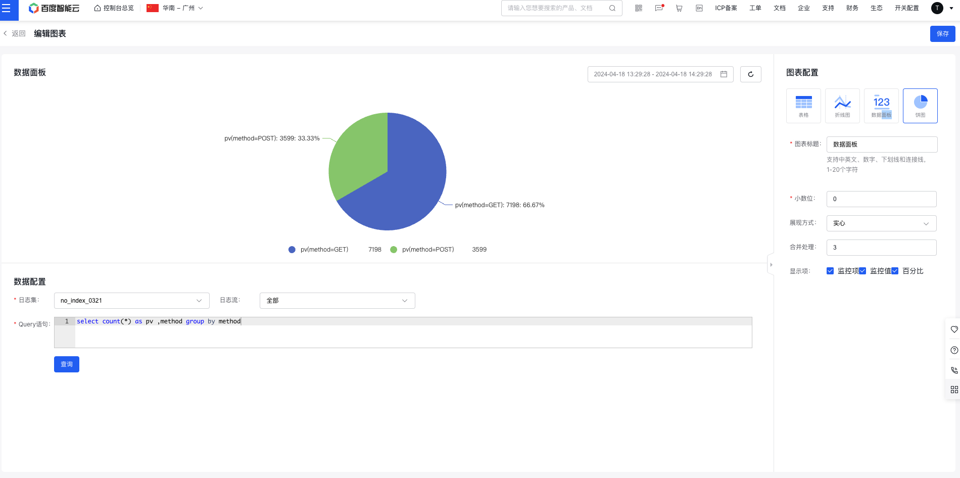
- Statement example: Calculate PV by methods
- select count(*) as pv ,method group by method
- Click Save to complete creation. The newly created chart will be displayed at the top by default
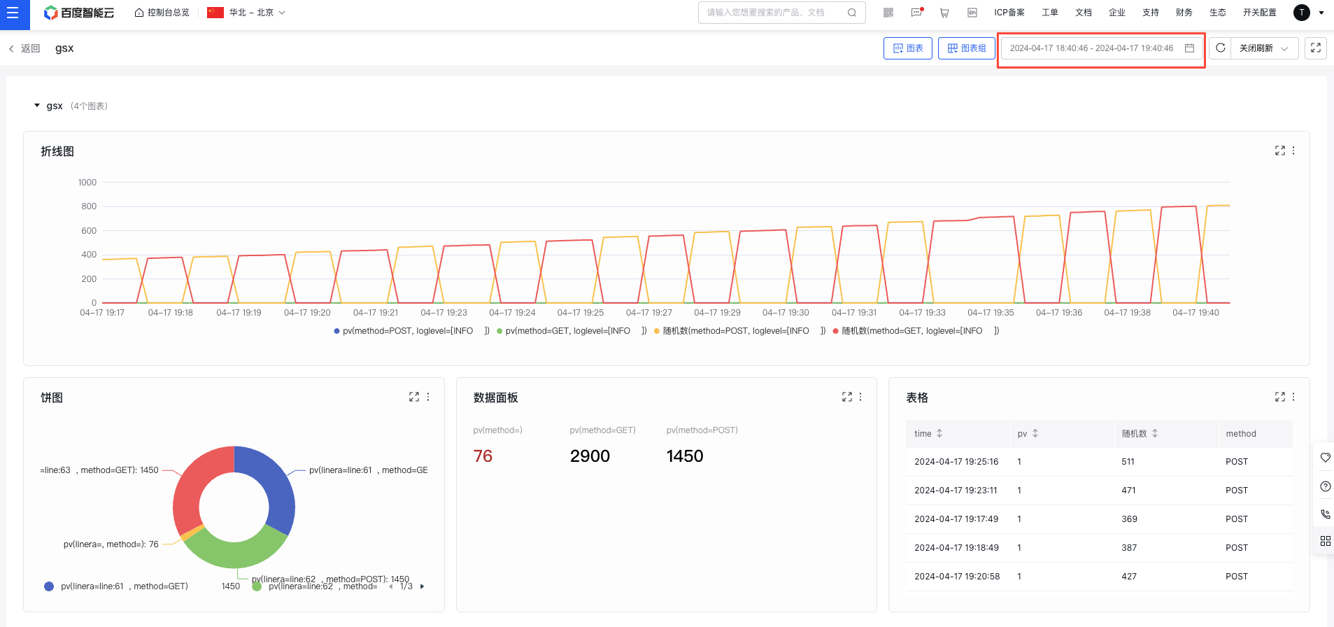
View chart
- Select "Dashboard" from the left navigation bar to enter the Dashboard List page.
- Click the dashboard name to access its details page and view all configured charts
Set the dashboard time range
Click the time selection module at the top of the page to adjust the time range for dashboard data display.
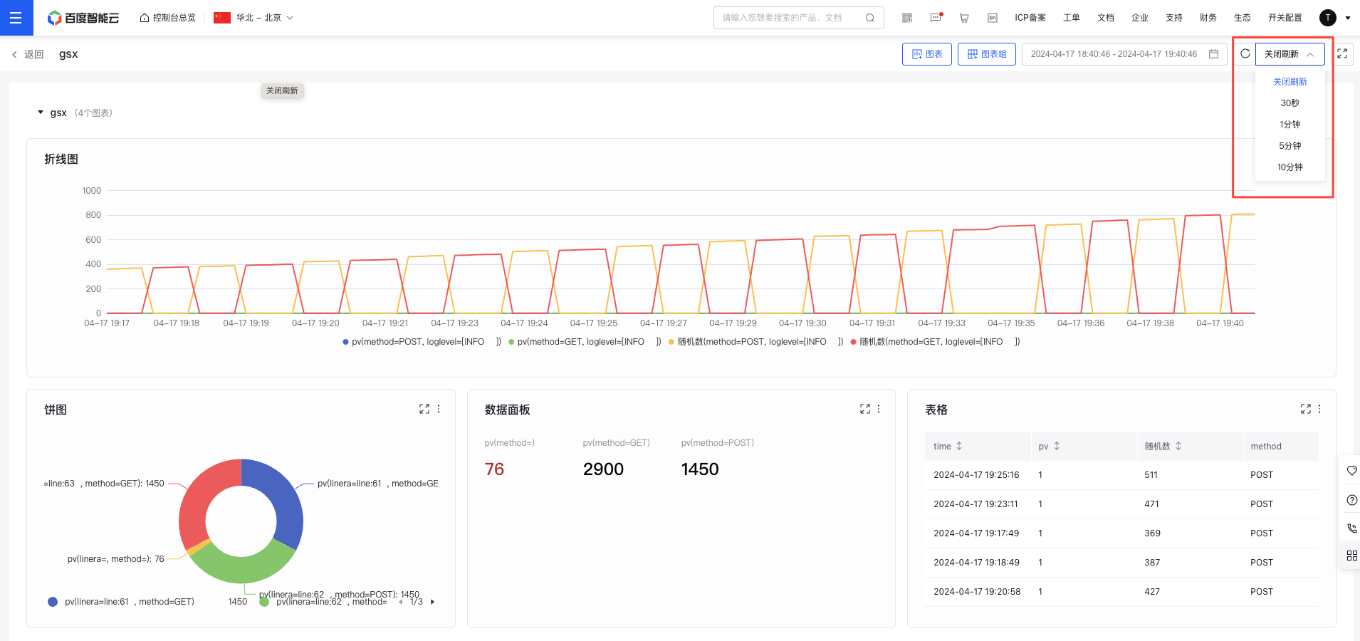
Enable real-time data refresh
Use the "Real-time Refresh" dropdown at the top of the page to select a time interval for refreshing chart data in real-time.
Edit/copy/delete chart
- Select "Dashboard" from the left navigation bar to enter the Dashboard List page.
- Click on the dashboard name to navigate to its details page.
- Click the "More" button in the chart's upper-right corner, then select "Edit" to enter the chart configuration page.
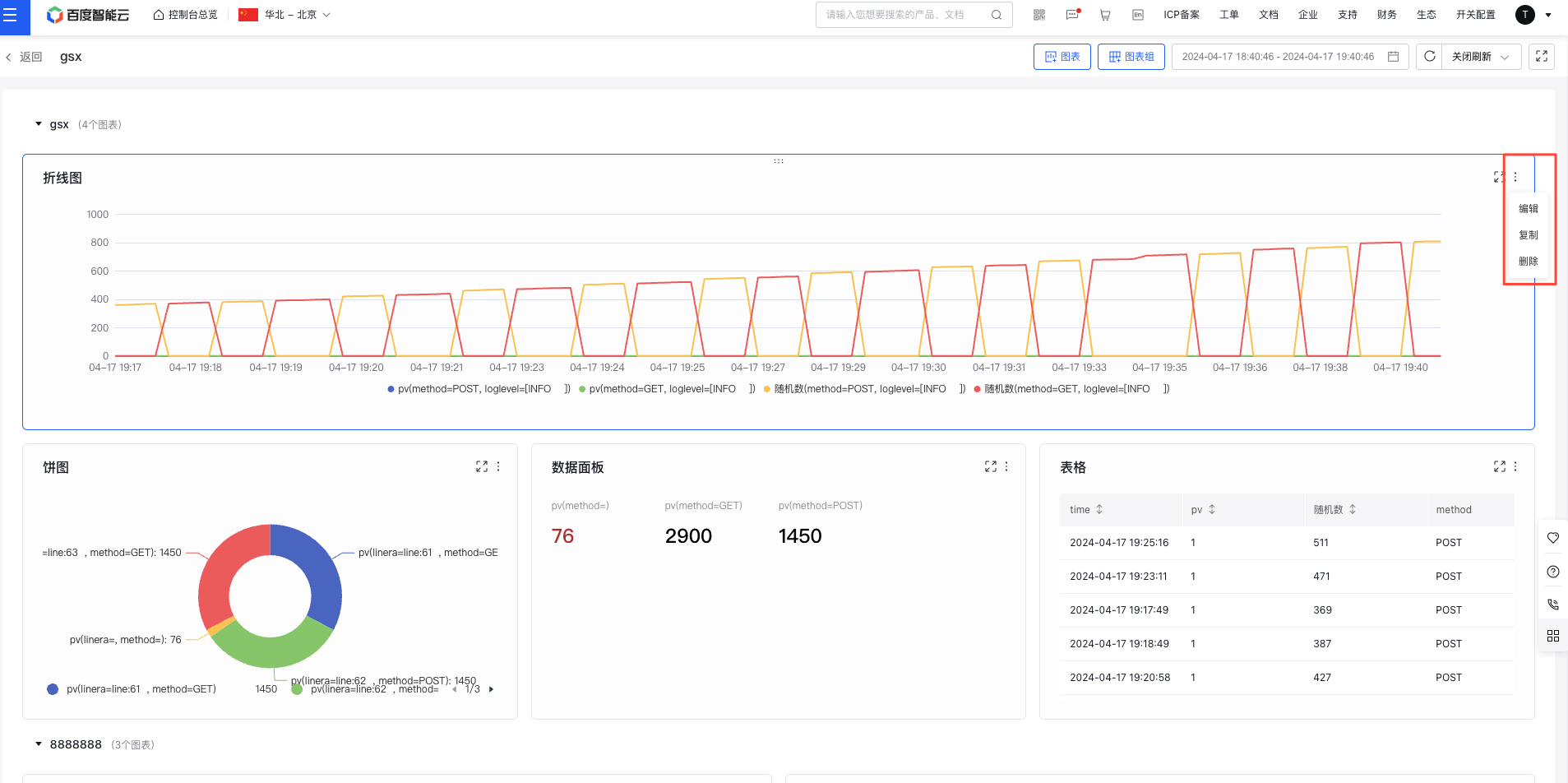
- Click the "Copy/Delete" button to duplicate or remove the chart.
Move chart
- Select "Dashboard" from the left navigation bar to enter the Dashboard List page.
- Click on the dashboard name to navigate to its details page.
- Hold and drag charts to sort them either within groups or to other groups