
Best Cases
Introduction
Welcome to MeDo Moment — your quick guide to getting the most out of MeDo. If you’re new here, this is the perfect place to start. If you’re already familiar with MeDo, we appreciate your feedback — your suggestions help us improve. Let’s begin your MeDo journey.
1. Chat mode
Pros: Ideal for non-technical users — it makes generating results fast and simple.
Cons: You may need several rounds of iteration to reach a polished outcome.
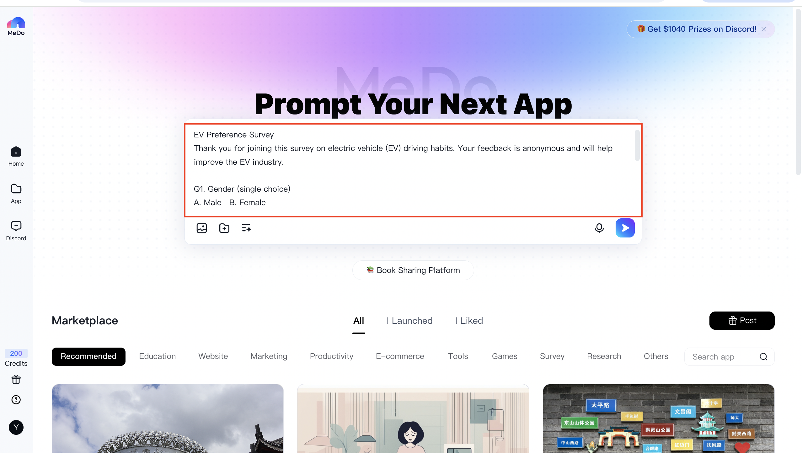
You can refine your idea through conversational dialogue. For example: “Create an H5 invitation page for a tech product launch that includes all the essential event details.”

After refining your prompt, MeDo can expand the brief into detailed application requirements, for example:
1Please design an H5 invitation page for a technology product launch. The design should feel modern and technical, and must include the following information:
2 - Product name
3 - Event date & time
4 - Event venue
5 - Key features or highlights of the product
6 - Registration method and deadline
7
8Deliver a complete H5 page design plan covering page layout, suggested color palette, interactive behaviors, and content modules.
9 - Page layout: Keep the layout clear and concise. The homepage should emphasize the product’s core value to help visitors quickly grasp its significance.
10 - Color palette: Incorporate a tech-inspired blue and white color scheme to convey a modern aesthetic.
11 - Interaction: Add touch/swipe and click interactions to enhance engagement.
12 - Content modules:
13   1. Cover: Product name, date/time, venue, and a tech-style background.
14   2. Product overview: Detailed features and highlights — mix of images, text, or video.
15   3. Registration: Registration portal with methods and deadline.
16   4. Interactive section: Include Q&A, polls, or other engaging activities.
17   5. Closing: A thank-you message, company contact details, and a teaser for future events.
18
19Module details:
20 - **Cover**
21   - Elements: Product name, date/time, venue, animated tech-style background (e.g., particle animation).
22   - Interaction: Auto-play subtle background animation; tap/click to enter the next section.
23 - **Product overview**
24   - Elements: High-res product images, core features, demo videos.
25   - Interaction: Swipe through images; tap Play to view demos.
26 - **Registration**
27   - Elements: “Enroll now” CTA, deadline reminder, attendee instructions.
28   - Interaction: Tap Enroll to open a registration form. Submission confirms enrollment. Add a countdown to create urgency.
29 - **Interaction**
30   - Elements: Short product-related Q&A and feature-preference voting.
31   - Interaction: Users can submit answers (with correct answers shown afterward) and vote; display real-time results.
32 - **Closing**
33   - Elements: Thank-you message, company logo, contact info (phone, email, website), and teaser for future events.
34   - Interaction: Tap the company logo to open the official website; tap “View More Events” to see upcoming activities.
2. Advanced mode: Comprehensive application
Pros: Full control — you specify the tech stack, UI, and interaction patterns.
Cons: Requires technical knowledge and clear product specifications.
Example 1
(Tech stack) Generate a frontend demo for an AI code editor called MeDo using React 19 + TypeScript + Vite + TailwindCSS + shadcn/ui. Default to a dark theme with a one-click toggle to light mode. (Product design & UI) Layout:
- Top fixed navigation bar: MeDo logo (left), tabs in the center (Demo, Template, Community), theme toggle and profile menu on the right.
- Left collapsible sidebar with four icon shortcuts: ① New Demo ② My Demo ③ Favorites ④ Settings.
- Main area: two-column layout — left: Monaco-style code editor (70%) with line numbers, syntax highlighting, Copy and Full-screen buttons; right: live preview iframe (30%) with Refresh and Export controls.
- Floating full-width input at the bottom: “Generate a demo with one sentence.” Pressing Enter triggers a loading animation; after ~10 seconds the generated code is inserted into the editor and the preview refreshes automatically.
- All buttons use subtle scale-on-hover animations (Framer Motion); sidebar collapse/expand is animated smoothly.
Generated effect:

Example 2
(Tech stack) Generate a mobile H5 subscription-management demo using React 19 + TypeScript + Vite + TailwindCSS 3 + Zustand. Default dark theme, one-click light mode. (Product design & UI) Structure:
- Three-layer navigation: ① Fixed top search bar + global “Add Subscription” button; ② Main area split into three tabs: Subscription, Statistics, Settings; ③ Bottom rounded TabBar that hides/shows on scroll.
- Subscription page: waterfall-style cards showing service logo, name, monthly/annual price, next billing date, and days remaining. Cards support left-swipe to delete, right-swipe to edit, and tap-to-view details (billing history charts + Modify button).
- Statistics page: Use Recharts for monthly/annual bar charts and a donut chart for totals; support time-range selection.
- Settings page: currency selector, pre-expiry notification toggle, and CSV export.
- All interactions (scale/fade, swipe, tab switches, chart transitions) should be fluid and polished.
User guide
Build value first: prioritize experience over appearance
A common mistake is obsessing over UI from day one. Your product exists to solve a problem — users care about solutions first, visuals second.
Follow this build priority: UX → Features → Database → UI
- User experience (UX): Before writing code, map the user journey. Which screens are needed? What is the simplest, most intuitive flow that delivers value? Even a great solution fails if users don’t know how to use it.
- Functionality: With the user flow defined, implement features that make each step work reliably and feel under user control.
- Database (DB): Once functions are clear, design the data model. You’ll know exactly what to store and how to secure it. Follow best security practices when designing schemas.
- User interface (UI): After the product works end-to-end, polish visuals — color, typography, spacing, and subtle animations. Ensure UI changes never break validated flows or obscure key actions.
Writing precise prompts: be specific and measurable
Your AI performs best with explicit instructions. Imagine a client saying, “Make this blueprint more aesthetic.” What does “more aesthetic” mean? Which parts? To which audience?
Golden rule for prompts:
“If I asked a 5-year-old to do this, would they understand what to do?”
If the answer is no, simplify and add detail.
The first query matters
The first prompt sets the project’s direction — treat it like your product’s foundation. A vague command like “create a recipe app” is not enough.
Before you write the first prompt, answer questions such as:
- Will the app have a homepage?
- Is there a login and registration flow?
- Will there be a dashboard? What should it show?
- Can users add their own content (e.g., ingredients or recipes)?
- Is the app monetized? Which payment provider will you use?
- What should the main visual tone be?
Write these answers down. Don’t rush — the initial prompt can take hours to refine, and that effort pays off.
Use other AIs (e.g., GPT, Claude, ERNIE Bot) to iterate on your prompt and test cohesion. Analyze competitor sites: send a URL with the AI and ask it to describe structure, colors, and fonts, then turn that analysis into a detailed design prompt for MeDo.
If you still have questions, add MeDo Assistant for one-on-one help. Thank you for reading!